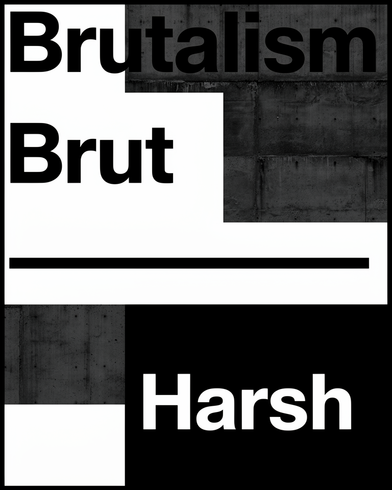
Brutalism
Béton Brut
Raw concrete, exposed structure, zero decoration. A confrontational style that puts honesty and function ahead of comfort, and on the web, ahead of polish.
From Concrete Slabs to Bold Pixels
Brutalism began in postwar architecture as a commitment to material honesty: show the concrete, show the bolts, hide nothing. When designers brought it to the web, they kept that same defiance: show the browser defaults, expose the grid, refuse to polish.
Le Corbusier's Unité d'Habitation
Raw concrete béton brut becomes a global architectural statement, inspiring a generation of civic megastructures.
Civic Megastructures
Government and university buildings worldwide adopt the monolithic language; brutalism becomes the architecture of public institutions.
brutalistwebsites.com
The site codifies "brutalist" as a distinct digital style, spreading the aesthetic across the design community and sparking endless debate.
Neo-Brutalism
Hard borders, flat blocks, and clashing color flood SaaS landing pages and portfolios; brutalism becomes the new cool for indie makers.
Honest, Heavy, and Uncompromising
Honest Materials
Default fonts, visible structure, no faux textures. The medium is shown, not disguised: what you see is exactly what the browser is made of.
Brutal Contrast
Heavy black borders, raw whites, one loud accent. Hierarchy by force, not finesse; the eye is dragged where the designer demands.
Monolithic Blocks
Big rectangular masses and oversized type create weight and architectural presence. The page feels built, not designed.
Function First
Every element earns its place. Friction is acceptable; decoration for its own sake is not. There is no room for the merely pretty.
When You Want to Be Remembered
Brutalism works wherever the goal is to signal bold conviction rather than safe competence. It suits contexts where originality matters more than reassurance, and where the audience can handle (or actively enjoys) aesthetic confrontation.
- 01Design & Dev PortfoliosSignal that you have taste and the confidence to ignore convention.
- 02Cultural & Arts InstitutionsGalleries, museums, and experimental venues where the design itself is part of the message.
- 03Indie & Activist ProjectsTools, zines, and campaigns that reject corporate polish on principle.
- 04Bold Product LaunchesSaaS and indie products that need to stand out in a sea of identical landing pages.
Brutalism Defined in Practice
These designs are worth studying precisely because they look wrong by every conventional measure, and don't apologise for it.
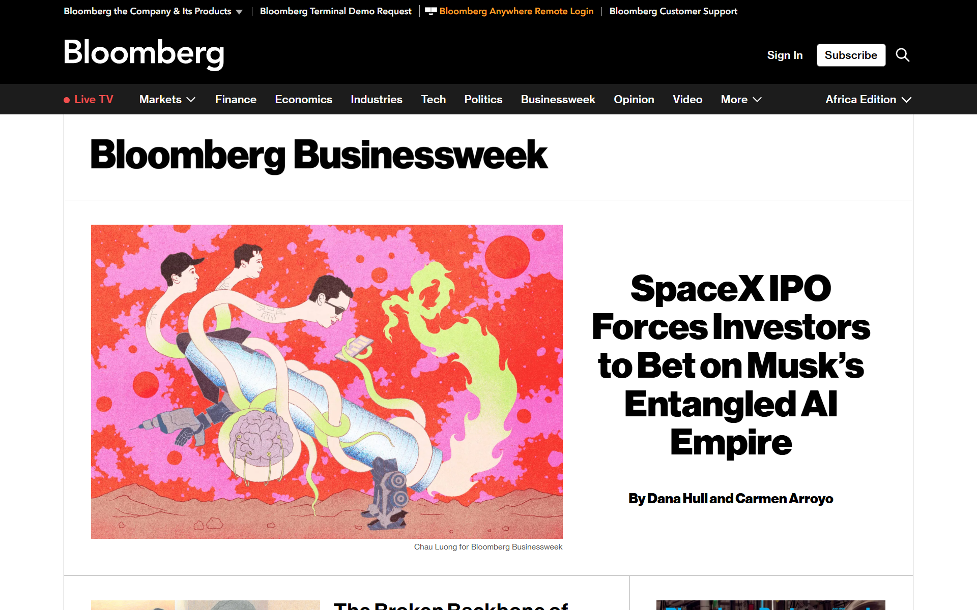
Editorial brutalism at scale: oversized type, raw grids, and a refusal to look like any other magazine website.
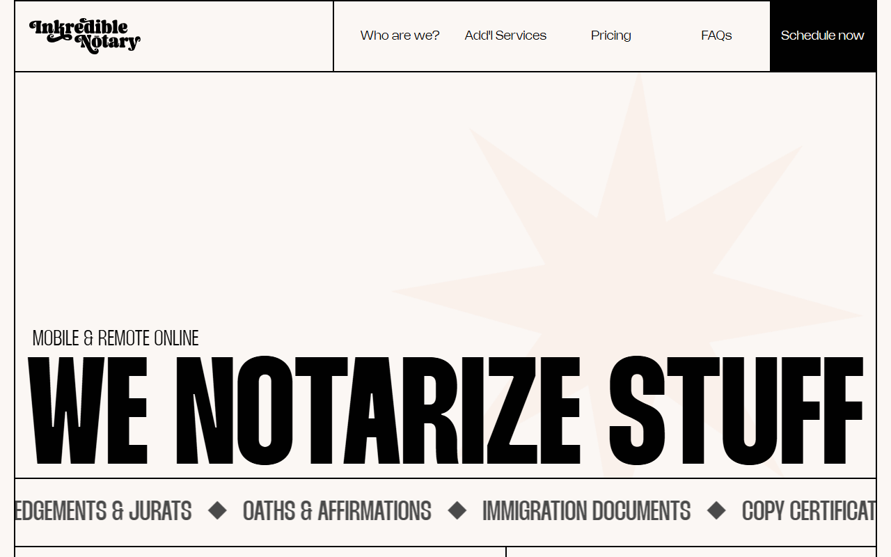
A notary service site that leans fully into raw brutalist aesthetics: hard borders, flat color blocks, and a layout that treats convention as optional.
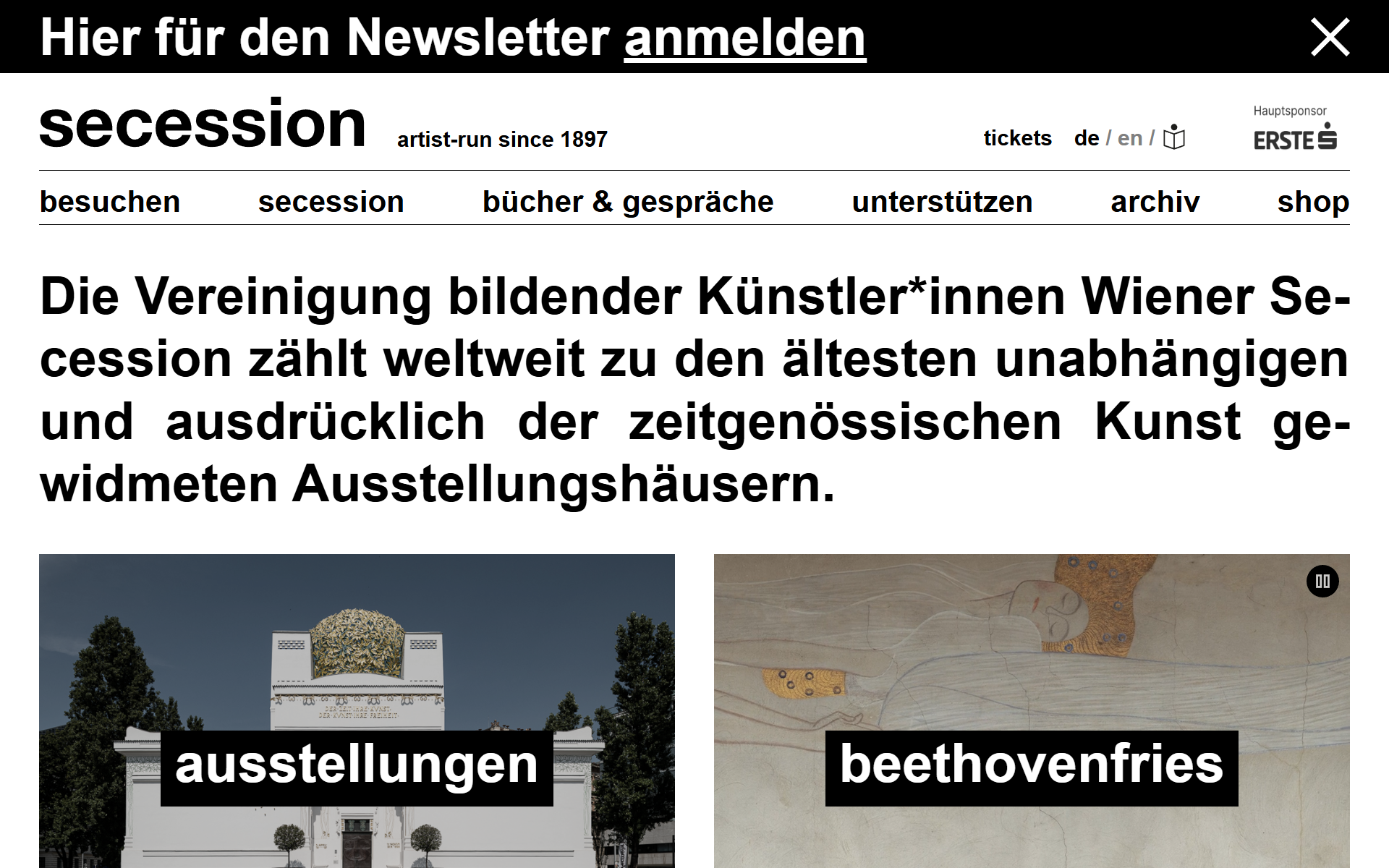
The Viennese Secession exhibition hall's site pairs institutional authority with uncompromising brutalist typography and grid logic.
The trade-offs
+ Strengths
- Instantly memorable: stands out in any competitive context
- Fast and cheap to build: no heavy assets or complex effects
- Performance-friendly by default: raw HTML loads fast
- Signals confidence and taste to the right audiences
− Watch-outs
- Polarising: audiences either love it or distrust it immediately
- Accessibility risk if contrast and structure are not handled deliberately
- Poor fit for trust-sensitive contexts like finance, healthcare, or legal
- Easy to overdo: becomes noise rather than statement without discipline
Builds coming soon
This style hasn't been built yet. Check back later.