Claymorphism
Soft & Puffy
3D without the uncanny valley. Inflated shapes, pastel gradients, and thick outlines give UI elements the friendly, tactile quality of modelling clay: approachable, soft, and impossibly appealing.
How Softness Became a Design Statement
Claymorphism emerged from the intersection of two forces: the pandemic-era appetite for comfort and warmth in digital interfaces, and Apple's quiet evolution toward more dimensional, tactile visual language in its system icons. When designer Michal Malewicz gave the style its name and a coherent specification in 2021, it was already happening organically; he just made it possible to talk about.
Pandemic-era Softness
As people spend more time in digital interfaces, demand grows for UI that feels warm, comforting, and tangible: a reaction against the cold precision of flat design.
Apple's Spatial Hints
Apple's new app icons and spatial audio UI use inflated, puffy 3D forms that suggest modelling clay: a subtle shift in visual direction that the design community notices and amplifies.
Named & Codified
Designer Michal Malewicz coins "claymorphism" and publishes a specification: inflated shapes, pastel gradients, thick drop shadows, and exaggerated outlines as defining features.
Mainstream Adoption
Consumer apps, game UI, and onboarding flows worldwide adopt claymorphism as a language for friendliness and approachability, particularly in fintech and health.
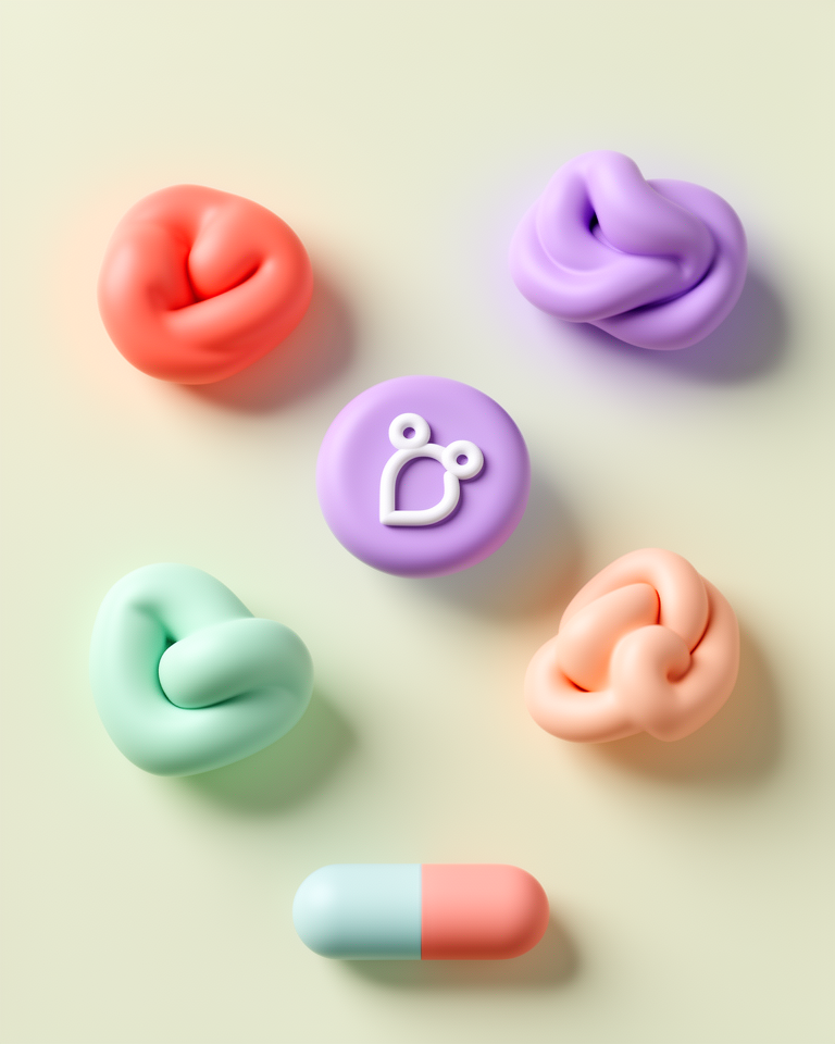
Puffy, Tactile, and Irresistibly Friendly
Inflated 3D Shapes
Elements appear to have been physically puffed up, rounded to the point of appearing squeezable. The geometry is 3D but not photorealistic, landing in a warm, cartoon-adjacent space.
Pastel Gradients
Soft, luminous pastels (peach, mint, lavender, powder blue) suggest internal illumination rather than external lighting, giving surfaces a gentle, ambient glow.
Thick Outlines & Shadows
Bold outlines and large, diffuse drop shadows separate clay elements from their backgrounds, reinforcing the sense of physical depth and tactile separateness.
Rounded Everything
Border radii are pushed to extremes: pill shapes, fully rounded cards, circular icons. Nothing has a sharp corner; the physical metaphor demands yielding, organic edges.
Making the Scary Feel Safe
Claymorphism excels wherever the design problem is to make something unfamiliar, complex, or anxiety-inducing feel approachable and safe. It is the visual equivalent of a friendly face, best deployed when the product needs to reduce friction and build trust through warmth.
- 01Consumer Mobile AppsOnboarding flows, gamification elements, and app icons where delight and approachability are conversion factors.
- 02Children's ProductsEducational apps, games, and digital products for young users where safety, friendliness, and tactile appeal are paramount.
- 03Fintech & Health AppsProducts in anxiety-inducing categories (money, medical) that use visual warmth to reduce cognitive friction and increase engagement.
- 04Gaming UICasual and mobile game interfaces where the style reinforces the playful, low-stakes register of the experience.
Clay in the Real World
The claymorphism implementations worth studying use the style's tactile warmth to solve a real UX problem, not as decoration on products that don't need emotional softening.
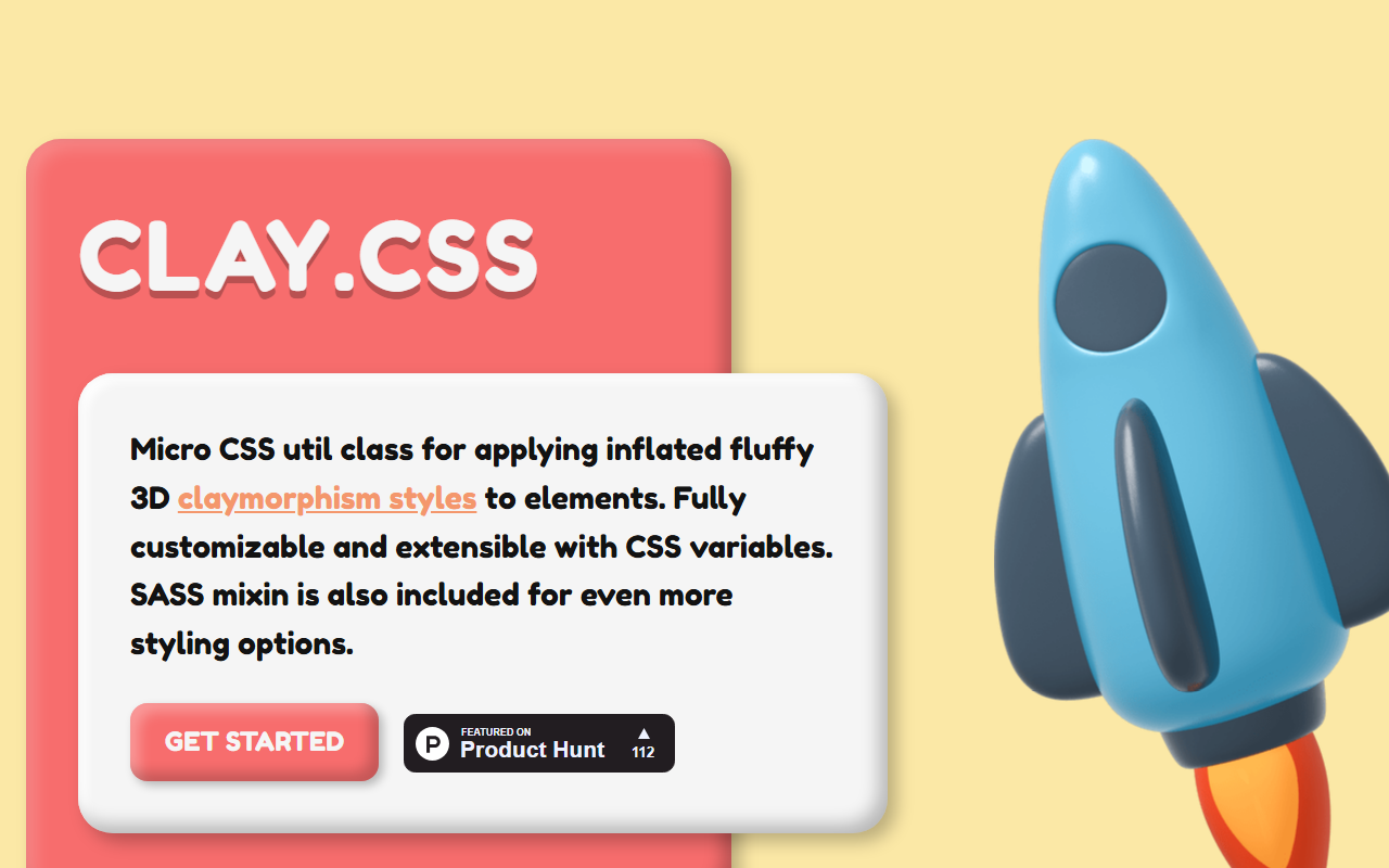
An open-source CSS library that distils claymorphism to its essence: one utility class that adds the inflated shadow, inner glow, and softened edges that define the style.
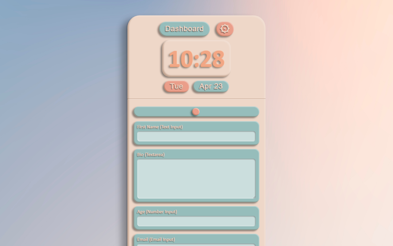
A focused demo page that shows claymorphism applied to common UI components: cards, buttons, and inputs, all given the puffy, tactile treatment in pure CSS.
The trade-offs
+ Strengths
- Extremely approachable: reduces cognitive friction in challenging product contexts
- Distinctive and memorable at a moment when flat design has become invisible
- Warm, human quality that builds emotional connection with products
- Works exceptionally well for illustration and character design
− Watch-outs
- Can read as juvenile: wrong register for serious B2B or professional tools
- 3D elements require more design and engineering effort than flat alternatives
- Trend risk: already ubiquitous, may date within 2-3 years
- Complex multi-layer shadows are performance-intensive on mobile
Builds coming soon
This style hasn't been built yet. Check back later.