Glassmorphism
Frosted Glass
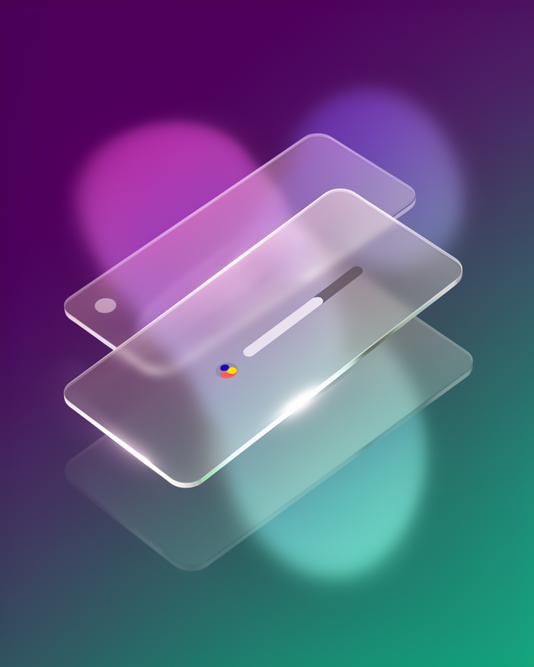
Frosted glass panels, luminous blur, and translucent layering gave the 2020s web a sense of physical depth without faking real materials. Glassmorphism emerged from Apple's macOS Big Sur and spread instantly through design tools, dashboards, and mobile UI.
From iOS translucency to a global design movement
The frosted-glass aesthetic began as a subtle Apple UI cue, then exploded into mainstream web and app design the moment macOS Big Sur made it unmissable. Within two years it had become the defining visual language of dashboards, login screens, and mobile widgets worldwide.
iOS 7 hints arrive
Apple's iOS 7 introduces translucent tab bars and blurred backgrounds, the earliest mainstream glimpse of the glass aesthetic at scale.
macOS Big Sur defines the look
Apple's macOS Big Sur ships with frosted sidebar panels and layered translucency that immediately becomes the canonical reference for glassmorphism.
The name sticks
UX Collective coins "Glassmorphism" in a widely shared article, and the term spreads through Dribbble, Figma community files, and YouTube tutorials overnight.
Maturity and restraint
Widely used in dashboards, login flows, and mobile apps, with the best implementations now moving toward deliberate restraint rather than wall-to-wall blur.
What makes glass, glass
Background blur
backdrop-filter: blur() creates the signature frosted-glass depth by blurring whatever lies behind a panel. The blur radius controls how "thick" the glass appears to be.
Translucent surfaces
Low-opacity white or colored fills let layered content show through the panel. Getting the balance right (readable but clearly see-through) is the core skill of the style.
Subtle borders
A 1px semi-transparent border catches the ambient light and defines panel edges without heaviness. This single rule does more work than any shadow to sell the illusion.
Layered depth
Elements float above a rich, often gradient or photographic background, creating genuine z-axis hierarchy. The background isn't decoration: it is structurally necessary to the effect.
Ideal when depth and modernity matter
Glassmorphism shines whenever you have a rich, colorful background to blur against. It elevates dashboards, onboarding flows, and media UIs, but demands a strong foundation layer to make the glass effect legible. On plain white backgrounds, the effect simply disappears.
- 01App dashboardsWidget cards and data panels float elegantly over gradient or image backgrounds
- 02Login & onboarding flowsA single glass card over a full-bleed photo creates immediate premium presence
- 03Music & media playersAlbum art provides the perfect backdrop; the UI lives on top without obscuring the content
- 04Premium SaaS productsSignals modernity and craft in a crowded market; pairs well with dark-mode-first design
Where glassmorphism lives in the wild
Glassmorphism has found a home across very different product categories (system UI, music apps, productivity tools) wherever teams want depth without skeuomorphism's overhead.
The trade-offs
+ Strengths
- Luxurious, modern feel that instantly reads as premium
- Natural depth without heavy image assets or complex shadow stacks
- Pairs beautifully with photography and gradient backgrounds
- Works well in both dark and light modes with minor palette adjustments
− Watch-outs
- backdrop-filter carries a GPU rendering cost, especially on mobile
- Text becomes illegible over low-contrast or highly varied backgrounds
- Overuse on Dribbble has made it feel clichéd in less considered work
- Requires careful layering discipline: overlapping glass panels turn muddy fast
Builds coming soon
This style hasn't been built yet. Check back later.