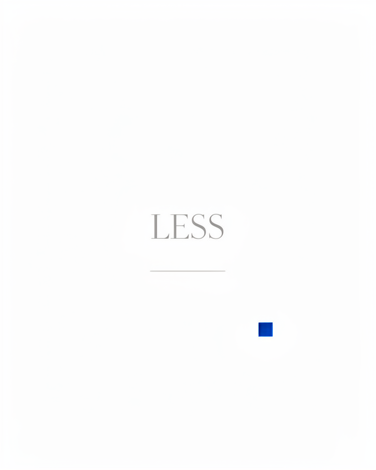
Minimalism
Less Is More
Minimalism removes everything that doesn't directly serve the user's goal, leaving typography, whitespace, and one accent to carry the entire design. Its origins in Bauhaus functionalism and Japanese Zen aesthetics made it the design language of choice for premium brands from Apple to Muji.
From Bauhaus workshops to the world's most visited websites
Minimalism as a design philosophy predates the web by decades: its roots are in Dieter Rams's functionalist industrial design and Japanese Zen spatial philosophy. When the web arrived, minimalism found its most public stage, and when Apple committed to it fully in the 2000s, it became the universal signal of premium digital quality.
Dieter Rams and Zen aesthetics
Dieter Rams's Ten Principles for Good Design and Japanese Zen spatial aesthetics define the philosophical core: remove until removal would cause damage.
Apple brings minimalism to the web
Apple's think-different-era site and the iMac G3 bring a minimal, white-space-led aesthetic to mass-market web design and consumer electronics.
iPhone — total commitment
The original iPhone's edge-to-edge glass and software-defined interface signals total commitment to reduction: hardware and software stripped to their essential purpose.
The premium default
From luxury fashion to developer tools, minimalism remains the default mode for premium digital identity, tested, proven, and endlessly iterated upon.
What remains when everything unnecessary is gone
Radical reduction
Every element must justify its presence; if it can be removed without loss, it goes. This discipline is harder than it sounds; removing things requires more confidence than adding them.
Whitespace as structure
Negative space is the primary design element; it guides the eye without competing for attention. In minimalism, whitespace is not empty: it is the most active part of the composition.
Typographic precision
A single typeface, precise size scale, and meticulous line-height define the entire visual system. Every typographic decision is load-bearing; there is no decoration to hide imprecision.
Monochrome base
Near-black on near-white, with at most one accent color used sparingly for action states only. The palette restriction forces hierarchy to come from space and scale, not color.
Where premium signals and frictionless clarity both matter
Minimalism is most powerful when the brand itself carries the emotional weight, when the product, the photography, or the editorial content is the spectacle, and the design's job is to stay out of the way. Without a strong brand anchor, minimal design can feel empty rather than refined.
- 01Luxury fashion & beautyThe absence of visual clutter positions the brand in the same tier as the product price point
- 02Premium consumer productsProduct photography does the work; the layout gets out of the way entirely
- 03Personal branding & portfoliosWork and writing speak for themselves without a visual aesthetic competing for attention
- 04Editorial & publishingLong-form reading demands low visual noise; minimalism is the ergonomics of extended reading
Minimalism executed at the highest level
Minimal digital presences worth studying share one trait: every element that remains is precisely considered, and nothing is there by default or inertia.
The Museum of Arts and Design's site uses restraint as its primary design tool: generous whitespace, a single weight of type, and nothing competing with the work.
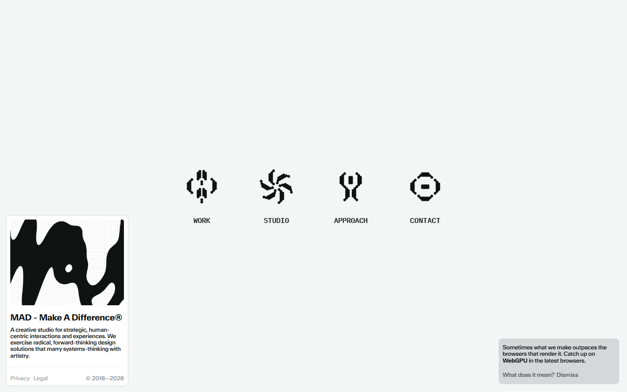
A studio site that strips the portfolio format to its bare minimum: project, title, image — and nothing else asking for attention.
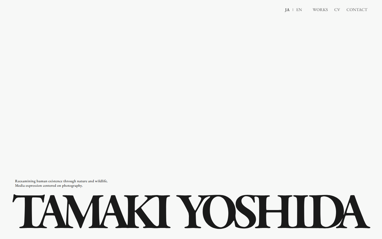
A photographer's portfolio where the design disappears entirely in service of the images: white space, clean type, and absolute compositional confidence.
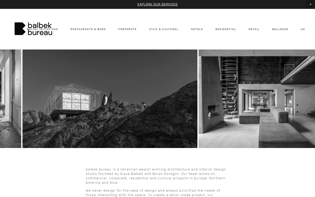
The architecture studio's site uses the language of minimalism to mirror its practice: precise grid, monochrome palette, and typography that holds the space without filling it.
The trade-offs
+ Strengths
- Timeless and premium-feeling; it does not go out of style
- Highly accessible with correct contrast ratios; low visual noise aids focus
- Fast to implement, fast to load; no decorative assets to manage
- Scales gracefully across every screen size without rethinking the layout
− Watch-outs
- Forgettable without a strong brand anchor: every minimal site looks the same
- Leaves little room for personality, warmth, or emotional expression
- Can feel cold, clinical, or even sterile in contexts that need approachability
- Easy to imitate poorly: the gap between minimal and bare is razor-thin
Builds coming soon
This style hasn't been built yet. Check back later.