Swiss
International Style
The International Typographic Style (known as Swiss Design) replaced ornament and expression with grid, Helvetica, and objective information hierarchy. Born in post-war Zurich and Basel, it became the design language of global corporations, transit systems, and modern institutions, and its influence on the web is total.
From Basel to the World
Swiss Design emerged from post-war Europe's desire for clarity and objectivity: a rejection of propaganda's visual excess. What began in two Swiss cities became the universal grammar of modern visual communication.
Basel & Zurich Origins
Armin Hofmann and Josef Müller-Brockmann develop the grid-and-Helvetica system in Basel and Zurich, publishing their principles in Neue Grafik magazine.
Global Adoption
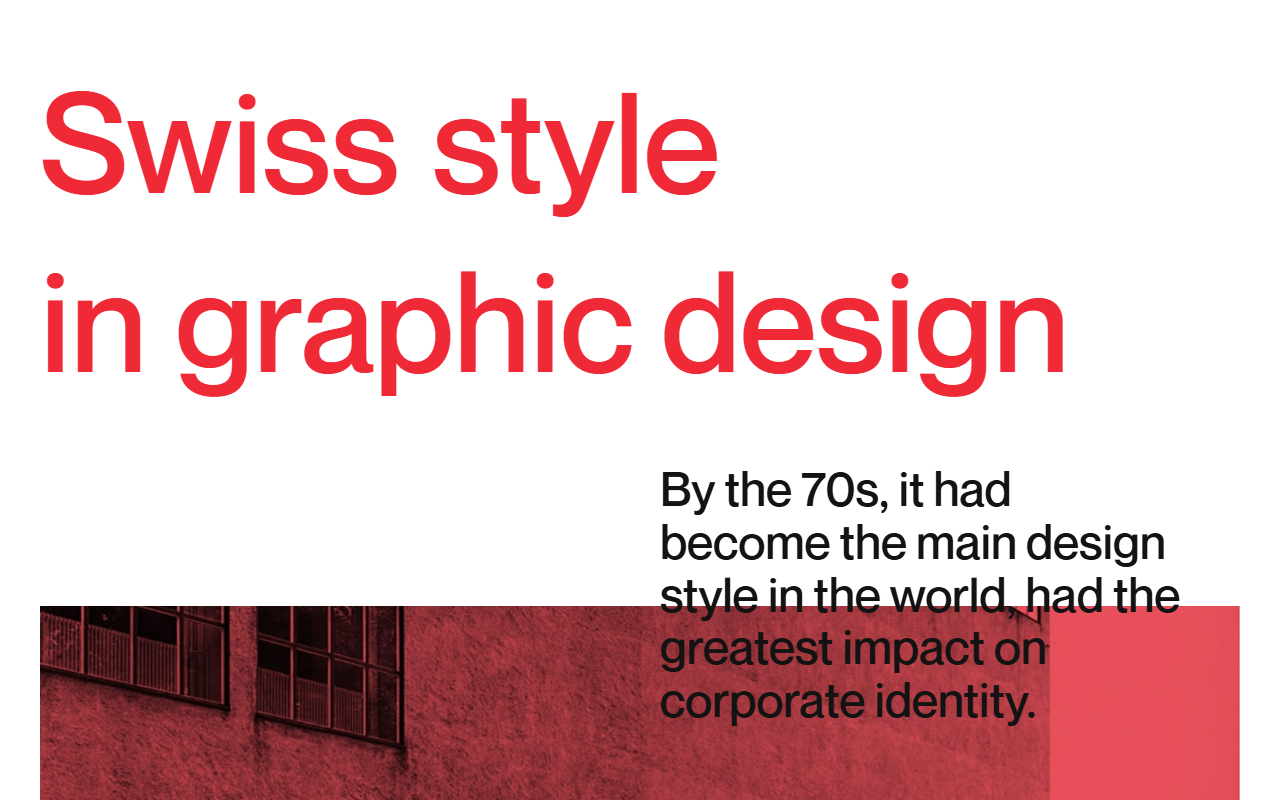
The style spreads globally, adopted by airlines, corporations, and governments from New York to Tokyo, becoming the dominant visual language of international institutions.
Vignelli's NYC Subway
Massimo Vignelli's New York City subway signage system brings Swiss principles to the public at massive scale, reaching millions of riders daily.
The Web's Default Language
The web's default grid, sans-serif typography, and visual hierarchy model is direct Swiss inheritance; it underpins virtually every professional digital interface built today.
What Makes Swiss Design Swiss
Mathematical Grid
Content placed on a strict modular grid; everything aligns to a single baseline and column system. The grid is not a suggestion but a constraint that creates coherence across an entire design system.
Helvetica & Grotesque Sans
Neutral sans-serif typefaces let content speak without typographic personality interfering. Helvetica's near-perfect neutrality was radical: type that disappears into pure communication.
Objective Hierarchy
Size, weight, and position alone establish order: no color, decoration, or illustration to distract. Information hierarchy is purely structural, making it scalable to any content type.
Red Accent Economy
A single accent (classically Swiss red) used only where navigation or emphasis demands it. Color as a structural tool, not decoration: one accent color, used sparingly, carries maximum signal.
Clarity at Any Scale
Swiss Design is the right choice when the message must be understood instantly by a diverse audience, when brand trust depends on perceived authority, or when information density requires rigorous visual organization. Its neutrality makes it work in almost any professional context.
- 01Wayfinding & SignageTransit systems, airports, campuses: any environment where navigation must work under pressure and at speed.
- 02Corporate IdentityGlobal brands that need visual consistency across dozens of markets, languages, and media.
- 03Government & Civic InstitutionsPublic bodies that need to project authority, legibility, and impartiality simultaneously.
- 04Design EducationTeaching foundational principles; Swiss style is the curriculum at almost every serious design school worldwide.
The Style in the Wild
Swiss Design's greatest examples are not websites; they are systems that shaped the built environment. But its direct descendants are everywhere in contemporary digital design.
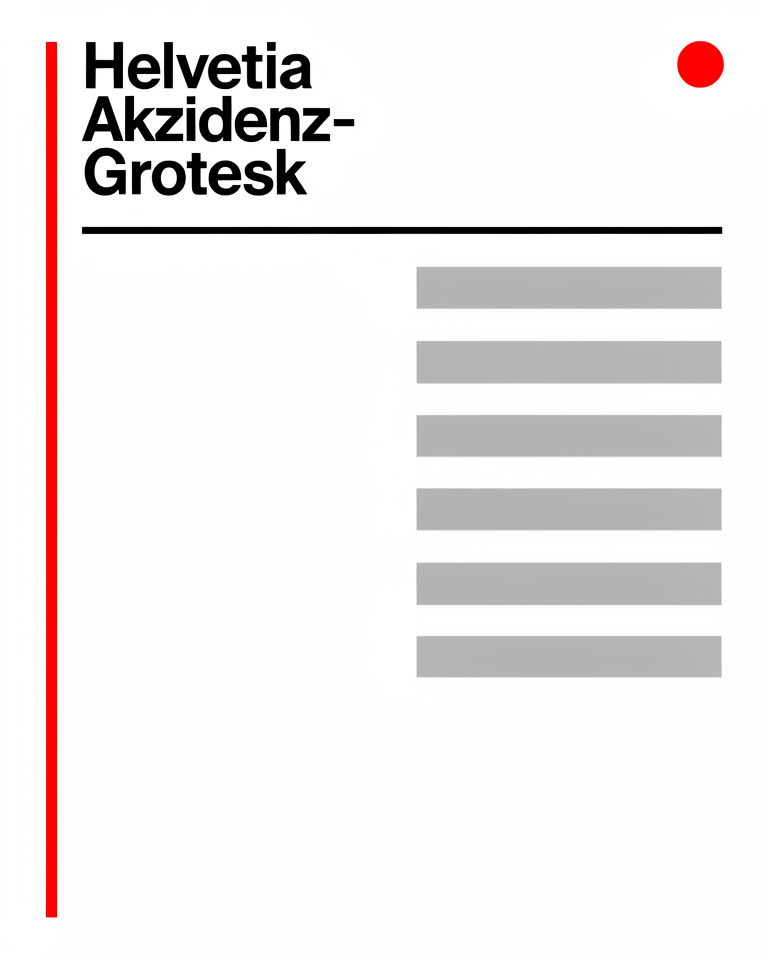
A dedicated showcase of the International Typographic Style applied to the web: strict grid, Helvetica-class type, and the clean structural hierarchy that defines the canon.
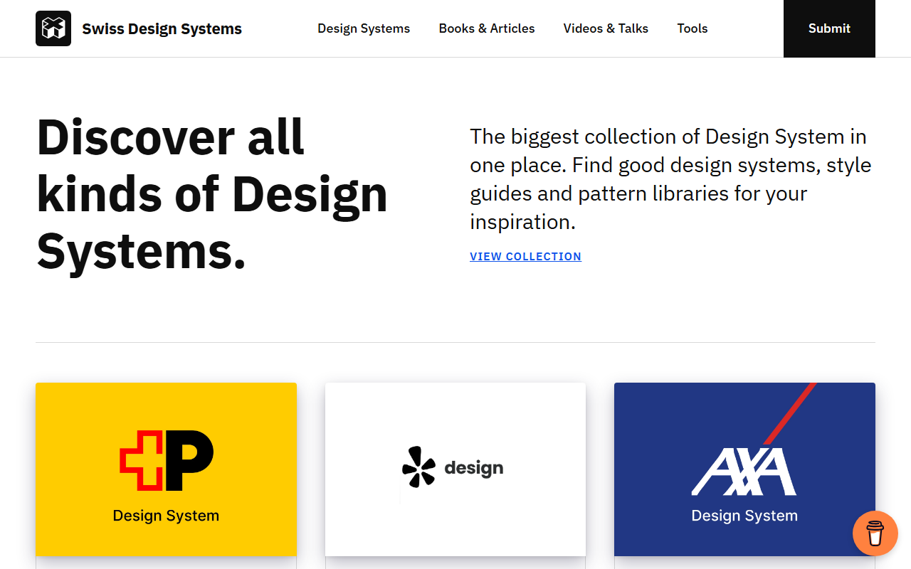
A design system built entirely on Swiss principles: mathematical grid, neutral grotesque typography, and hierarchy expressed through scale and weight alone.
The trade-offs
+ Strengths
- Timeless: Swiss work from the 1960s still reads as contemporary and credible today
- Works across media and scale without losing coherence, from business card to billboard
- Deeply legible for diverse audiences across languages and literacy levels
- Respected by design-literate audiences: signals craft and intelligence to those who notice
− Watch-outs
- Can read as cold or corporate: neutrality is not the same as warmth or approachability
- Requires real typographic skill to execute well; bad Swiss is just boring, not elegant
- No warmth or personality by design; wrong choice for brands that need emotional connection
- Ubiquity has diluted its authority: every SaaS startup uses a Swiss-adjacent aesthetic now
Builds coming soon
This style hasn't been built yet. Check back later.