Typographic
Words as Image
Typographic design treats letters and words as the primary visual medium: scale, spacing, rhythm, and contrast replace decoration. When type does all the work, every headline becomes a composition, every body paragraph becomes texture, and the grid itself becomes a graphic element.
A Century of Type as Art
Typographic design as a self-conscious discipline began at the Bauhaus, where designers first asked what type could do beyond carrying words. A century later, variable fonts and fluid type scales have made expressive typography the most accessible it has ever been.
Bauhaus Typography Workshops
Moholy-Nagy and Herbert Bayer explore type as pure visual form at the Bauhaus, treating letterforms as geometric compositions independent of verbal meaning.
Swiss International Style
The Swiss International Style codifies type hierarchy into a global system, elevating typographic structure from workshop experiment to corporate standard.
Emigre & David Carson
Emigre magazine and David Carson push expressive type to its outer limit in the printed word, proving that letterforms could be illegible and still communicate feeling.
Variable Fonts & Fluid Type
Variable fonts and fluid type scales make expressive typography technically accessible to every web designer: the most exciting moment for web type since font embedding arrived.
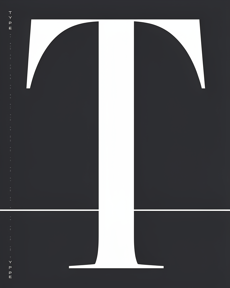
When Type Does Everything
Type as Image
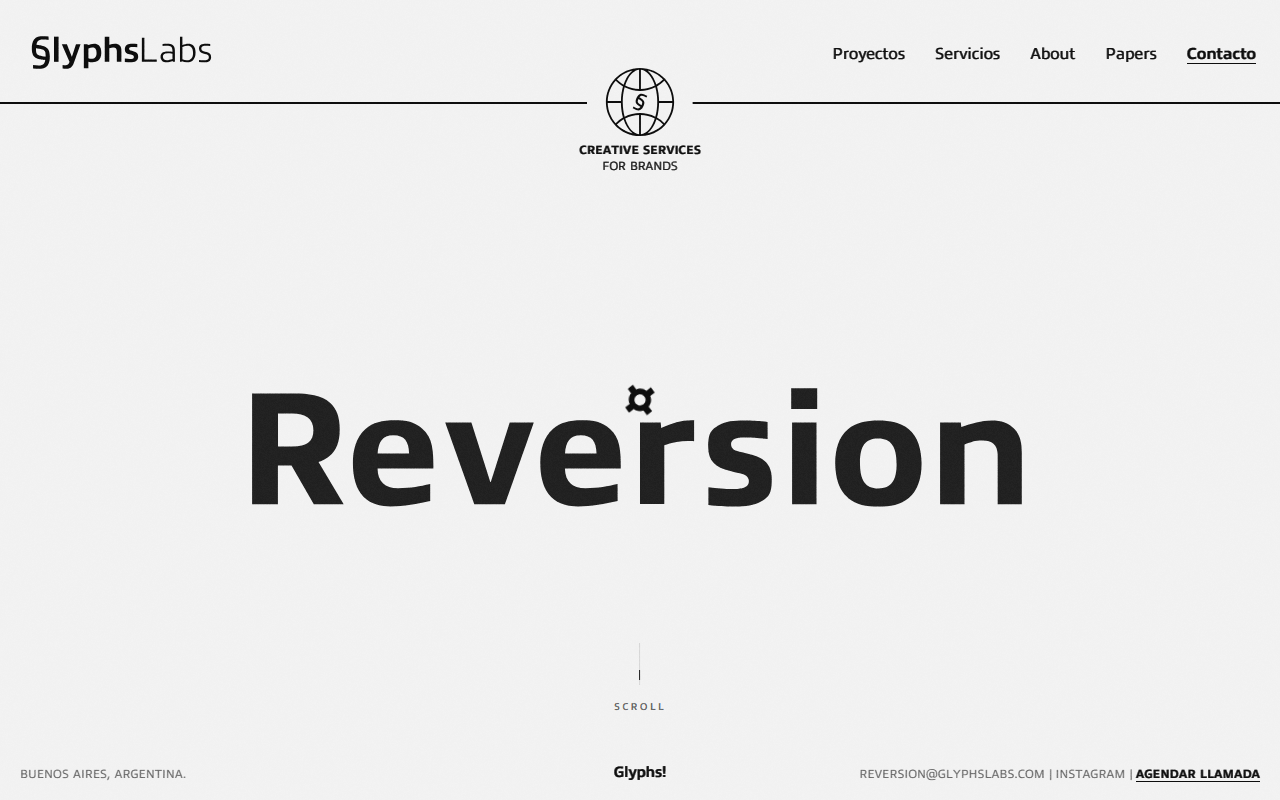
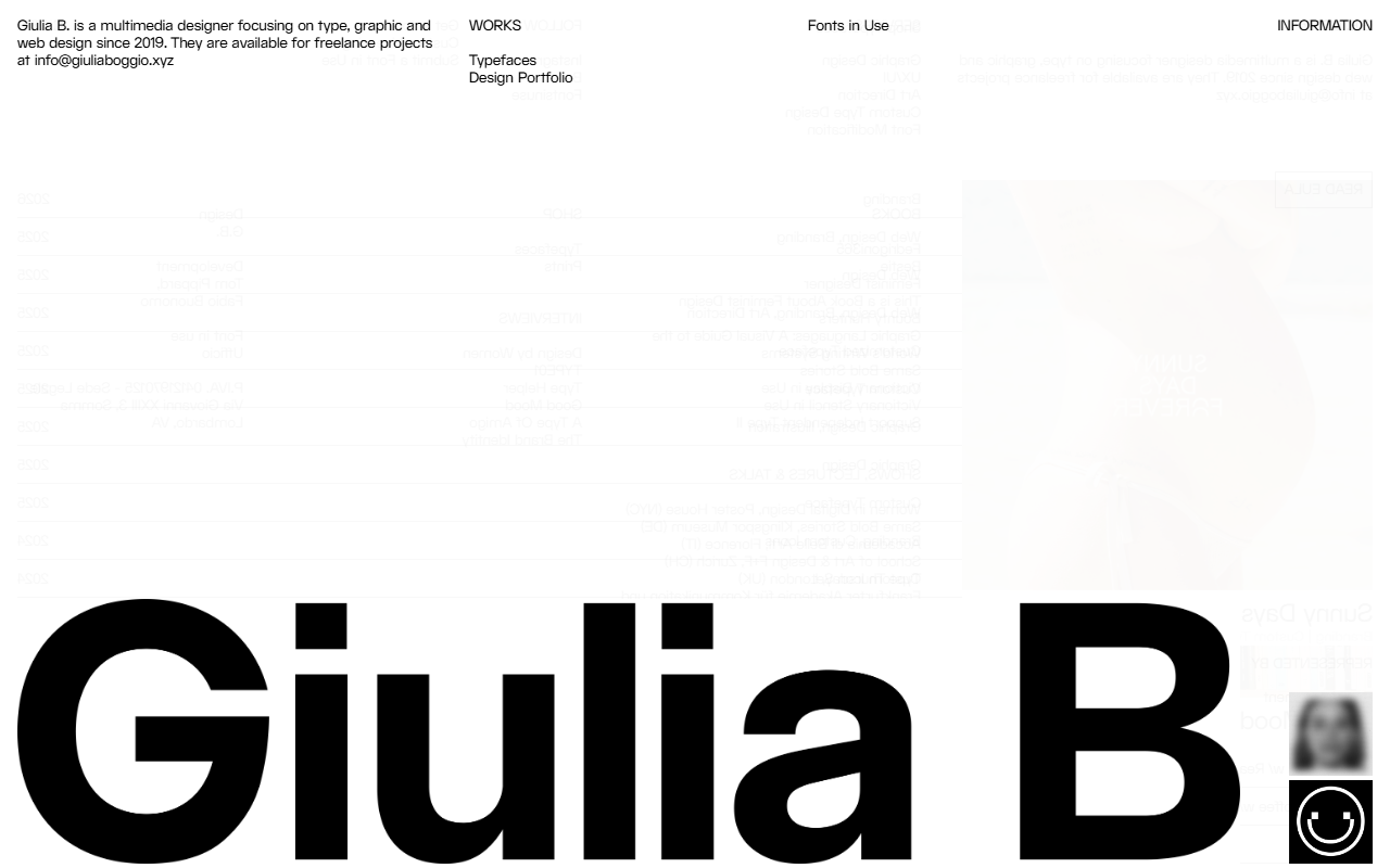
Headlines set at display scale (80px to 200px) become visual anchors, not just words. The letterform itself carries weight, mood, and brand identity without any supporting illustration.
Controlled Scale
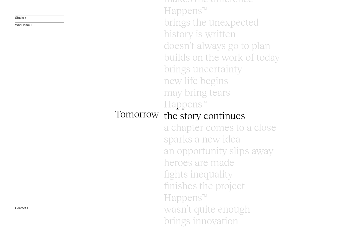
A documented type scale from micro-label to display ensures system-wide harmony. Each size step has a clear role (label, caption, body, subheading, heading, display), and nothing exists between steps.
Rhythm & Leading
Consistent vertical rhythm built on a baseline grid makes long-form text comfortable to read. Every paragraph, heading, and caption sits on the same invisible grid, creating order from the bottom up.
Minimal Non-Type Elements
Photography, illustration, and color are subordinate to the type system; used only when type alone cannot carry the content. The discipline is in knowing when to add and when to withhold.
Where Words Lead
Typographic design is the natural home for content-driven products: publications, cultural institutions, and brand identities where the quality of thinking matters as much as the visual surface. It rewards audiences who read carefully and signals intelligence to design-literate viewers.
- 01Editorial & PublishingNewspapers, magazines, and long-form digital publications where reading is the primary act.
- 02Brand IdentityWordmarks, brand systems, and marketing for companies whose identity is built on thought and voice.
- 03Cultural InstitutionsMuseums, galleries, theatres: organisations where the programme and text are the product.
- 04Design PortfoliosDemonstrating typographic skill is itself a portfolio statement; type-forward work signals craft immediately.
Type in Command
The best typographic design on the web is found in publications and brand marketing where writing is the core product; places where type has to carry full creative weight.
A type-first site where letterforms are the spectacle: large-scale type treatments, tight spacing, and a layout that makes typography the entire visual argument.
A portfolio where type sets every hierarchy and carries all the visual weight — no illustration, no photography competing for attention, just the precision of the letterform.
A studio site that uses experimental typography as its core design move: scale, tracking, and placement treated as expressive tools rather than neutral containers for text.
A photographer's portfolio stripped to pure typographic structure: the type system does all the work of layout, hierarchy, and identity without any decorative support.
The trade-offs
+ Strengths
- Infinitely scalable: good type systems work from mobile to large display without breaking
- Fast to load: few image assets means excellent performance and Core Web Vitals scores
- Ages well: strong typographic work from the 1990s still looks considered today
- Demonstrates design intelligence: immediately signals craft to design-literate audiences
− Watch-outs
- Requires genuine typographic skill: badly set type is immediately obvious to anyone who reads
- Limited visual variety without type expertise; the system can quickly feel monotonous
- Web font performance needs active management; too many weights and variable fonts can hurt load time
- Wrong choice when the audience scans rather than reads: type-first design rewards attention it may not get
Builds coming soon
This style hasn't been built yet. Check back later.