Editorial
Read Me
The newspaper column reborn: intelligent white space, careful typographic hierarchy, and the confidence to let words do the heavy lifting. A design language that says your content is worth reading slowly.
Typography as Architecture
Editorial design is among the oldest and most mature disciplines in graphic design, born from centuries of typesetting, refined through the golden age of magazine and newspaper publishing, and translated to the screen with the rise of digital long-form content. Its principles are timeless because they solve a permanent problem: how do you hold a reader's attention through large amounts of text?
Golden Age of Print
Alexey Brodovitch at Harper's Bazaar and Art Paul at Playboy establish the vocabulary of editorial design: dynamic layout, white space as a tool, photography and type as equals.
Digital Newspapers
Early web newspapers import print conventions (masthead, column structure, bylines), though bandwidth and screen constraints limit typographic ambition for a decade.
Medium & the Long-form Renaissance
Medium, Substack, and responsive web design together unlock editorial design for the open web; variable fonts, generous line lengths, and deep reading experiences become achievable at scale.
Newsletter & Content Revival
The newsletter boom and the rise of independent publishing platforms bring editorial design to a new generation of writers; typeface quality and layout sophistication continue to improve.
Type Does the Work
Typographic Hierarchy
Headline, standfirst, byline, body, caption: each level has its own size, weight, and spacing. The hierarchy is so clear that readers can navigate by glance alone, before reading a word.
Generous White Space
Margins, leading, and padding are generous; space is used as a design element, not a waste of real estate. White space signals editorial confidence and slows the reader down productively.
Column Grid
A structured column grid (whether 2, 3, or 12) organises content with journalistic logic. Columns create rhythm, enable pull quotes and sidebars, and give the layout architectural structure.
Strong Photography
Editorial design uses images as storytelling partners, not decoration. Hero images carry emotional and narrative weight; captions are treated as essential prose, not afterthoughts.
Where Words Are the Work
Editorial design works wherever the primary value is the quality of the content; the design's job is to make that content as readable, credible, and pleasurable as possible. It is content-first design by definition, and any product claiming to be about reading should use it.
- 01News & Magazine SitesJournalism, feature writing, and long-form reporting where credibility and readability are the primary design goals.
- 02Blogs & NewslettersIndependent publishers and Substack writers who want their content to feel as professionally crafted as their writing.
- 03Brand JournalismCompanies that publish editorial content as a core marketing strategy; the design quality is evidence of the brand's intellectual seriousness.
- 04Documentation & Knowledge BasesTechnical writing, help centres, and educational content where structure and readability directly affect comprehension.
Editorial at Its Best
These examples treat the web as a medium deserving the same typographic rigour as print, proving that generous, structured layouts hold readers better than information-dense ones.
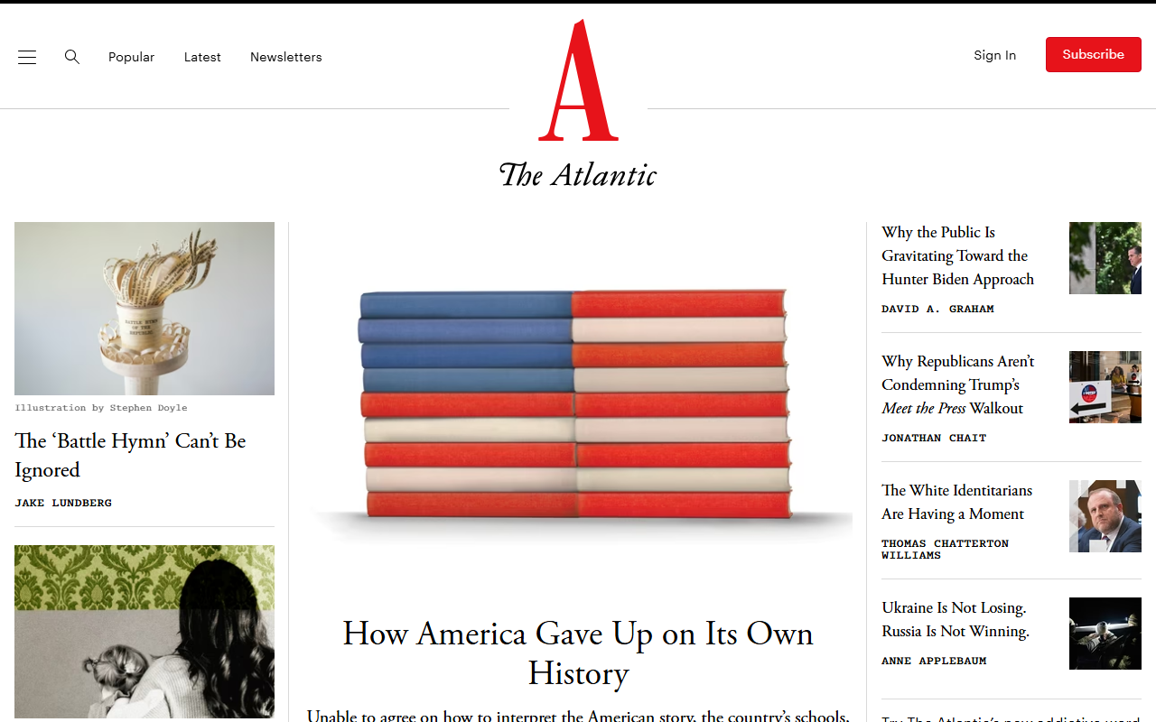
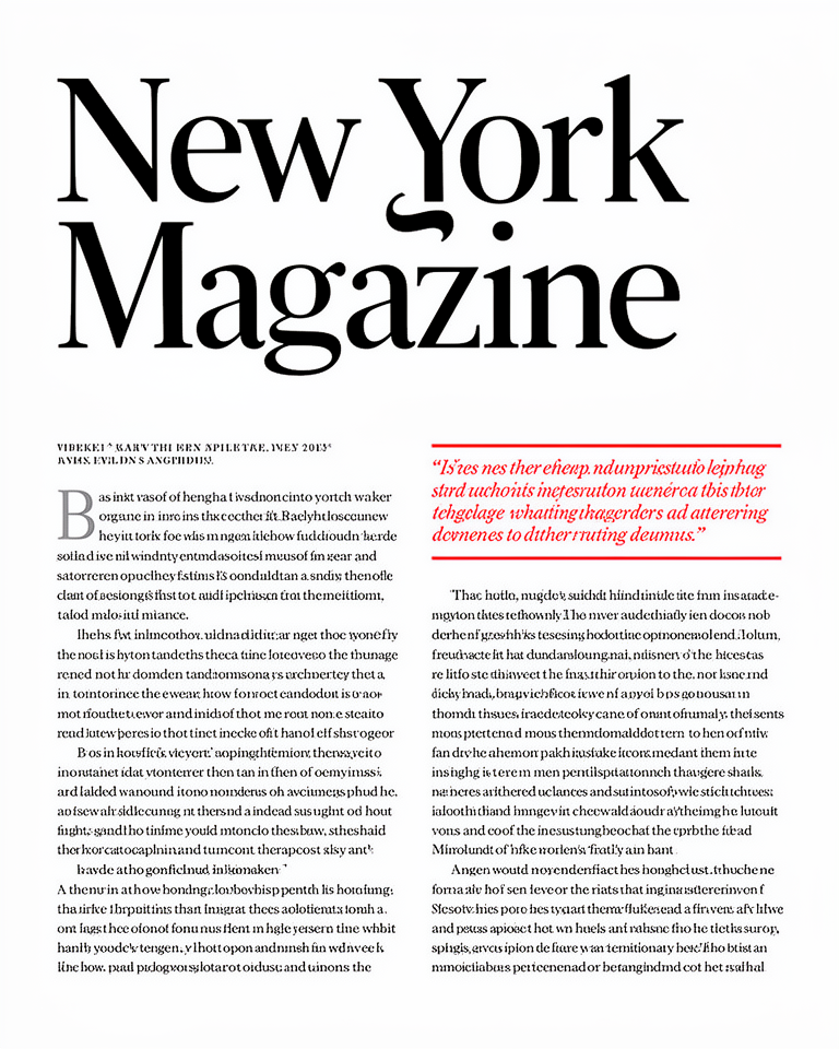
The magazine's digital presence translates its print heritage into a rigorous web design: generous leading, strong section hierarchy, and images treated with genuine editorial intent.
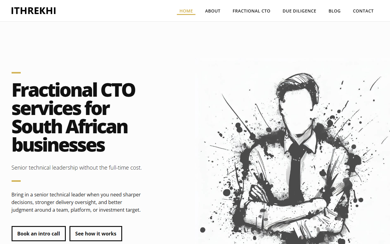
A fractional CTO practice whose site uses editorial conventions at small scale: a single gold accent rule, ink-splash illustration, and a typographic hierarchy that does all the selling.
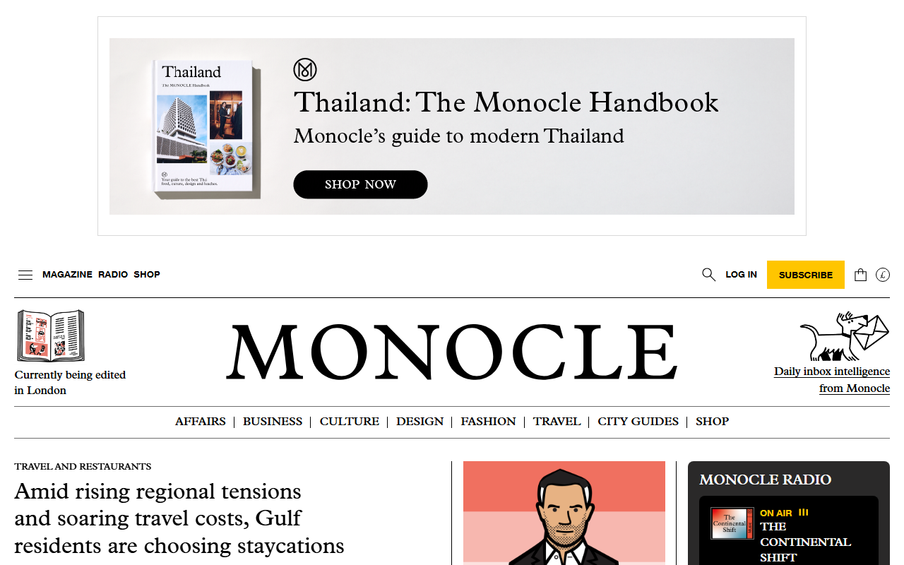
The global affairs and culture publication's website maintains its magazine's typographic personality and column structure: editorial identity as brand identity.
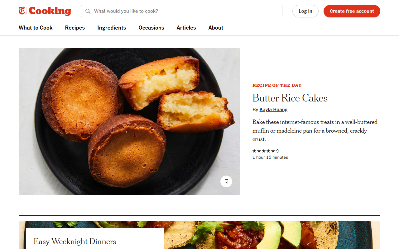
The recipe section uses editorial design principles (strong photography, generous white space, clear hierarchy) to make functional content feel like pleasurable reading.
The trade-offs
+ Strengths
- Content-first: the design serves the writing rather than competing with it
- Highly legible at any reading length, optimised for sustained attention
- Conveys credibility and editorial seriousness effortlessly
- Scales from short-form news to long-form features without visual disruption
− Watch-outs
- Requires excellent content: weak writing is exposed rather than hidden
- Can feel slow and formal for products that need immediate action
- Typography-first design requires genuine font expertise to execute well
- Less suited to single-page apps or interaction-heavy products
Builds coming soon
This style hasn't been built yet. Check back later.