Corporate
Business Standard
Corporate web design is the trusted lingua franca of enterprise: structured grids, restrained palettes, readable typography, and reassuring predictability. It prioritizes credibility and clarity over personality, building trust the moment users land.
How Business Learned to Speak the Web
Corporate web design evolved in lockstep with business adoption of the internet, from clunky first-generation text tables to today's polished, component-driven systems. Each era absorbed the prevailing design trends while keeping the core priorities of legibility and trust intact.
The First Wave
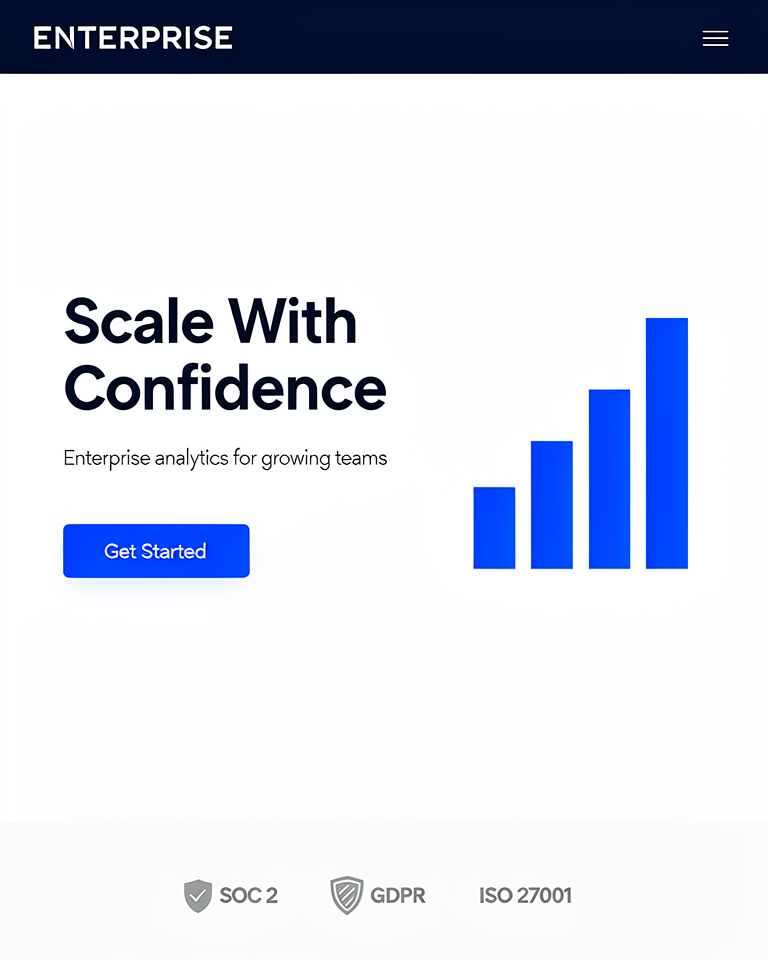
Fortune 500 companies move online with structured, text-heavy sites: essentially digital brochures that mirror the look of printed annual reports.
Web 2.0 Polish
Gradients, rounded corners, and drop shadows arrive in the corporate playbook, giving enterprise sites a friendlier, more approachable face.
The Flat Standard
Flat design and responsive layouts become the new corporate norm: clean, device-agnostic, and influenced by Material Design and iOS 7.
Confident Modernity
Clean grids, video heroes, and bold sans-serif typography define the current corporate site: polished but not flashy, credible but not stiff.
Structure, Credibility, and Clarity
Grid Discipline
Strict 12-column grids create order and professionalism at a glance. Alignment is non-negotiable; every element relates to every other through the underlying system.
Restrained Palette
Blues, grays, and whites communicate stability and competence; one brand accent adds personality without introducing chaos or frivolity.
Hierarchy Clarity
Type scales, whitespace, and consistent components guide users effortlessly from headline to CTA; nothing competes for attention unnecessarily.
Trust Signals
Testimonials, client logos, certifications, and statistics are woven into every section: the design infrastructure of institutional credibility.
When Trust Is the Product
Corporate design is the right choice whenever the stakes of a first impression are high and the audience is evaluating you for reliability rather than originality. It signals that you operate at scale, that you understand professional norms, and that you take your users' time seriously.
- 01Enterprise SaaSB2B software where procurement teams and IT decision-makers need immediate confidence.
- 02Financial ServicesBanks, insurers, and investment platforms where credibility is table stakes before any conversion.
- 03Consulting & Professional ServicesLaw firms, accountants, and management consultancies selling expertise and judgment.
- 04Healthcare & LegalRegulated industries where design disorder signals operational disorder to cautious audiences.
The Corporate Benchmark
The notable corporate websites are the ones that became invisible by doing everything right: functional, trustworthy, impossible to criticise, and equally hard to remember.
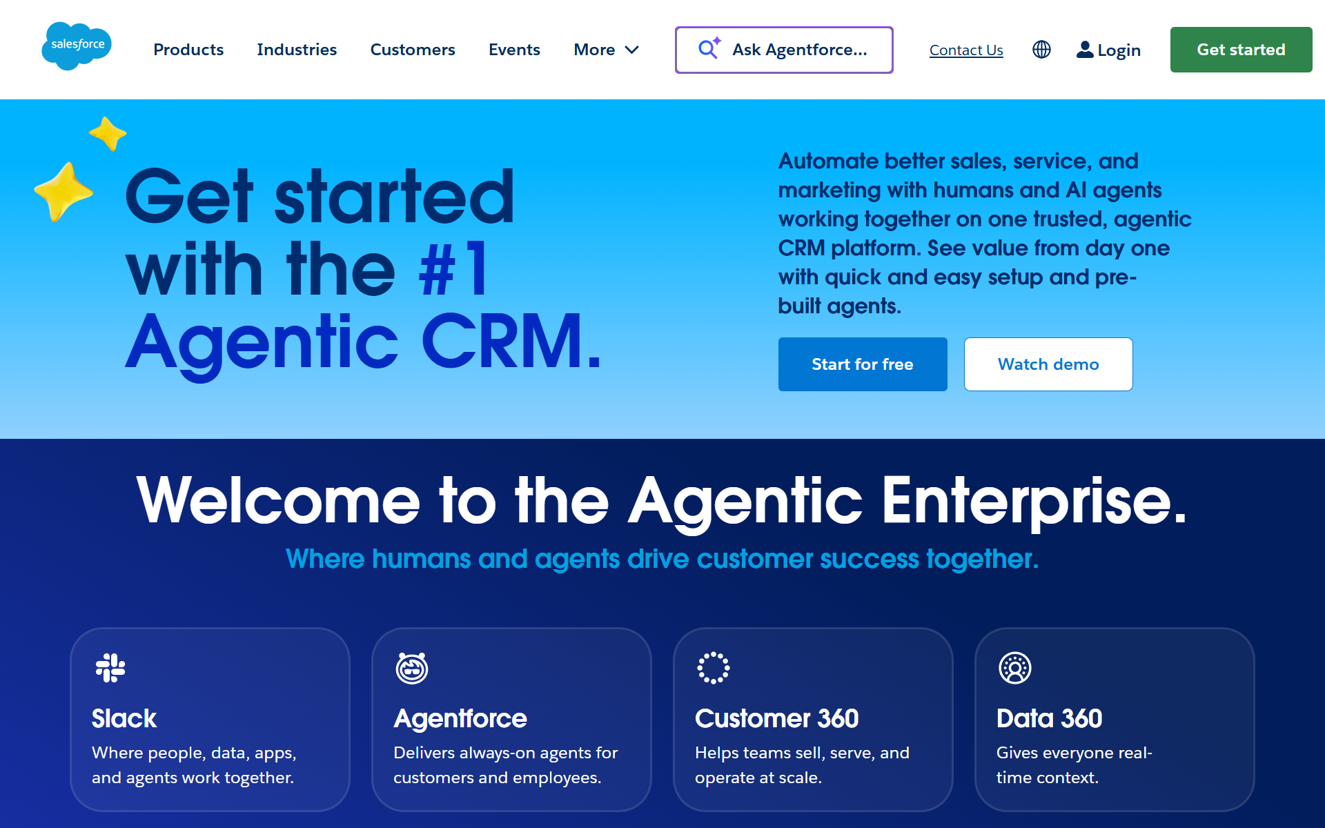
The defining enterprise SaaS site: hero video, grid layout, logo wall, and a CRM for the design itself.
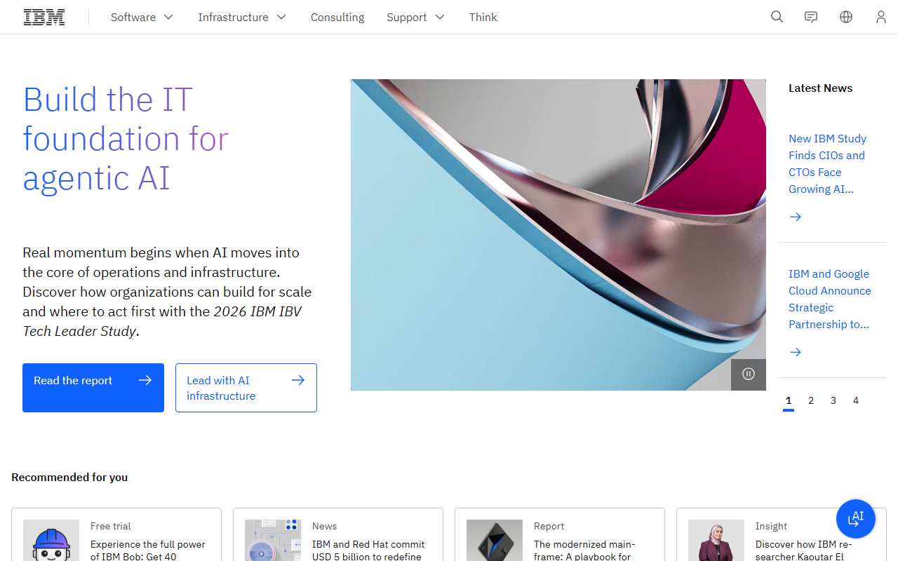
Century-old brand translated into a rigorous digital design system; Carbon Design System is corporate discipline made open-source.
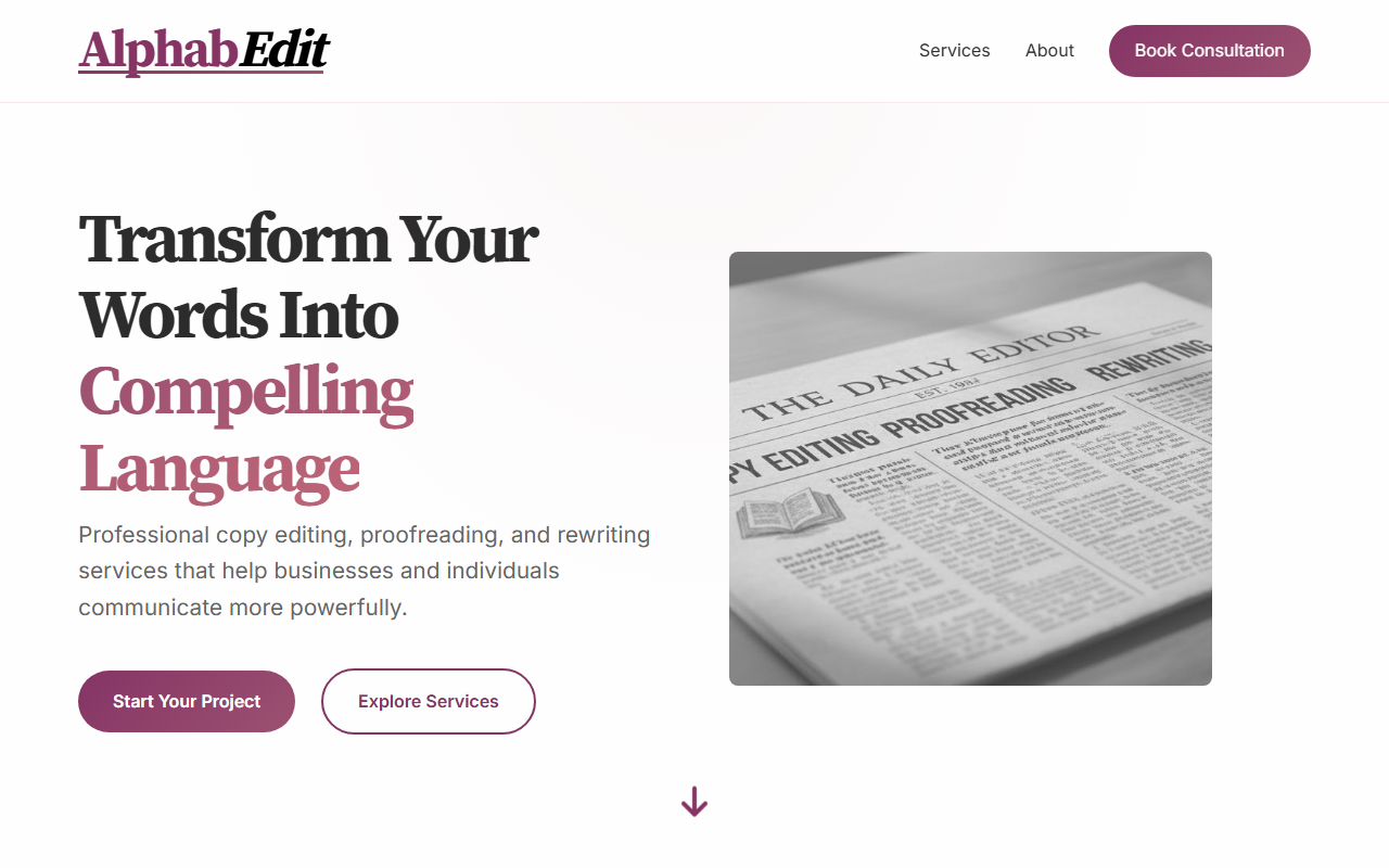
A freelance copy editing service that shows corporate conventions working at small scale: service cards, statistics row, and a consultation form arranged exactly as the playbook demands.
Global scale corporate design that balances accessibility, brand consistency, and the needs of radically different product audiences.
The trade-offs
+ Strengths
- Universally legible across cultures, industries, and devices
- Builds institutional trust rapidly with skeptical professional audiences
- Scales across large teams and multi-product organizations without fragmenting
- Well-supported by mature component libraries and design systems
− Watch-outs
- Risks looking generic: one corporate site looks much like another
- Personality and brand warmth are hard to inject without disrupting the grid
- Fails to differentiate in crowded markets where all competitors use the same playbook
- Can feel sterile and cold to consumer audiences expecting emotion
Builds coming soon
This style hasn't been built yet. Check back later.