Cyberpunk
Neon Dystopia
Dark interfaces, glitching neon, and dystopian atmosphere borrowed from a future that never arrived. Cyberpunk design channels William Gibson and Blade Runner into the browser: electric color on black, glitch effects, and a world where technology and decay coexist.
From Paperback Fiction to Digital Aesthetic
Cyberpunk began not as a design movement but as a literary genre: a dark, near-future vision of cities drowning in corporate neon and human augmentation. When cinema and then the internet got hold of it, those same visual codes became a style all of their own.
Neuromancer
William Gibson's landmark novel invents the visual language of cyberspace: a dark, glowing, networked world that designers would spend decades trying to render on screen.
Screen Culture Goes Cyber
Hackers and Johnny Mnemonic bring the aesthetic to mainstream cinema: neon, scanlines, and terminal green convince an entire generation that this is what the future looks like.
Synthwave Revival
Indie games and the synthwave music explosion spark a deliberate cyberpunk design revival online; retro-futurism meets contemporary UI.
Commercial Mainstream
Cyberpunk 2077 and the dark-mode-everything movement push the style to new commercial audiences; it is now a legitimate option for mainstream entertainment brands.
The Grammar of Neon and Darkness
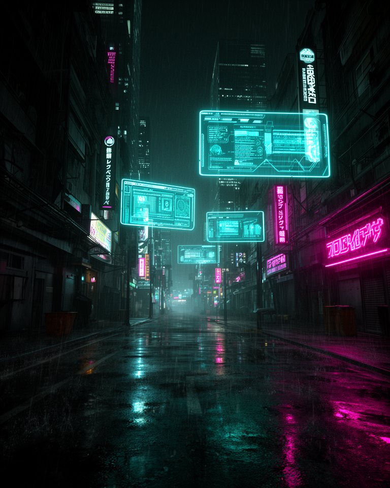
Neon on Black
Electric cyan, magenta, and acid yellow against near-black backgrounds: maximum visual drama achieved through extreme value contrast and saturated hues that almost vibrate.
Glitch & Noise
Scan lines, chromatic aberration, and RGB channel distortion suggest a corrupted digital reality: imperfection as atmosphere, noise as meaning.
Techy Typography
Condensed monospace and angular display fonts read like terminal output or HUD overlays; legibility is secondary to tone and atmosphere.
Grid Overlays
HUD-style UI elements, data readouts, targeting brackets, and corner markers frame the content; the interface pretends to be mission-critical software.
When Atmosphere Is the Product
Cyberpunk earns its keep in contexts where immersion and genre signaling matter more than universal accessibility. It works when the audience already understands the reference and wants to be inside it; the design itself is part of the experience being sold.
- 01Gaming & EsportsTeam sites, game launches, and tournament platforms where the audience lives in the aesthetic.
- 02Music & Festival PromotionElectronic, industrial, and synthwave acts whose brand identity is inseparable from the look.
- 03Tech Product LaunchesHardware, peripherals, and developer tools targeting enthusiast audiences who respond to the vocabulary.
- 04Film & Entertainment MarketingScience fiction, thriller, and action properties that want to extend their world into the promo site.
The Style at Full Power
The strongest cyberpunk design work uses the aesthetic not as decoration but as worldbuilding; every element of the interface reinforces the fiction that the user has entered a near-future system.
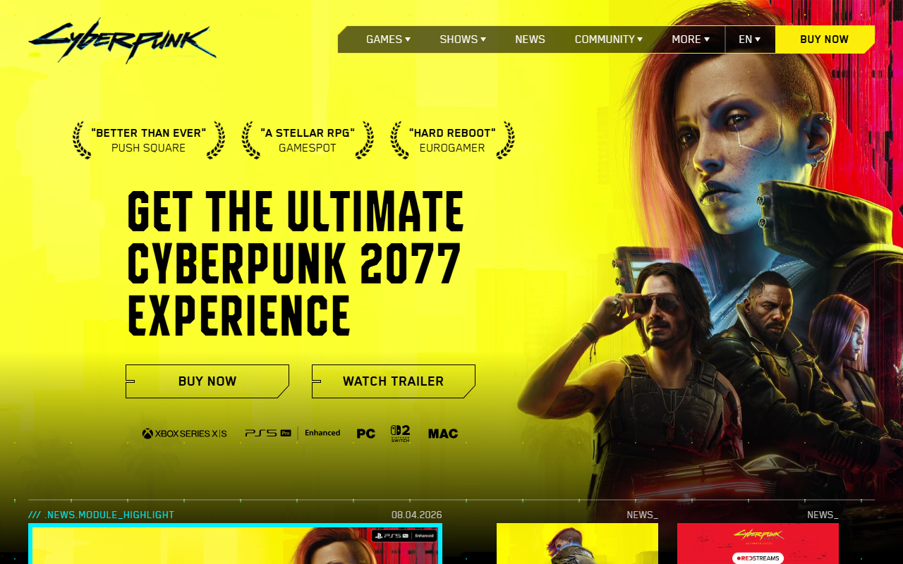
CD Projekt Red's official site set the benchmark for commercial cyberpunk web design: scanline overlays, neon color, and immersive full-screen video.
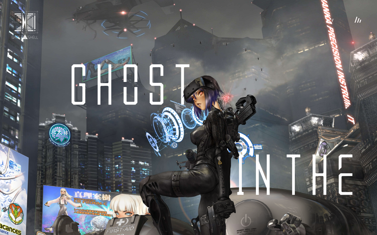
The film's site captures Mamoru Oshii's visual language directly: translucent panels, neon reflections, and layered information dense enough to feel like a live system.
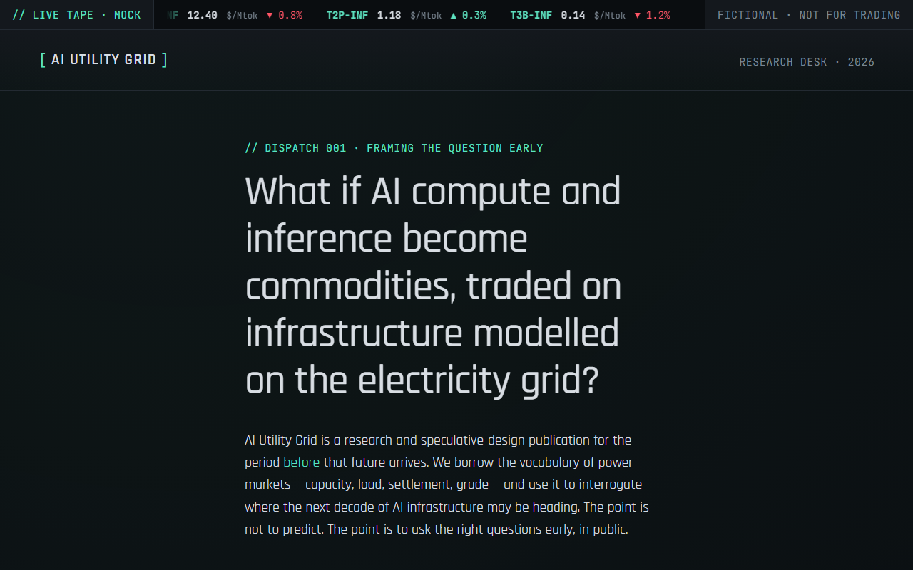
A speculative research publication that deploys cyberpunk's surface vocabulary with editorial restraint: monospace type, cyan accents, and a terminal aesthetic applied to serious intellectual work.
The trade-offs
+ Strengths
- Deeply atmospheric: users feel inside the world, not browsing a page
- Appeals strongly and immediately to the target demographic
- Memorable and immersive in a way that clean design cannot replicate
- Dark mode is the natural state; no adaptation needed
− Watch-outs
- Narrow audience appeal: outside the genre, it reads as aggressive or illegible
- Heavy asset loads from video, particle effects, and custom shaders
- Accessibility is poor when low-contrast neon text is used decoratively
- Trend-driven: the aesthetic dates quickly when the cultural moment passes
Builds coming soon
This style hasn't been built yet. Check back later.