Retro
Golden Age
Retro design mines the past for visual warmth and cultural meaning: the muted palettes of offset print, the wood type of early advertising, the badge culture of American mid-century. On the web it says: we know our history, and we're proud of it.
The long arc of looking back
Retro aesthetics have always coexisted with their era; nostalgia is a constant cultural force that design has drawn on for as long as there has been a past to revisit. What changes is which decade gets mined, and by whom.
The golden source
American mid-century commercial art (diners, vinyl records, motel signs, and drive-in culture) defines the visual vernacular that retro design most reliably returns to.
Psychedelic meets nostalgia
Psychedelic era graphics merge with commercial nostalgia; the aesthetic deepens with new layers of texture, saturated color, and hand-lettered typography.
Craft culture goes digital
Craft beer, artisan coffee, and vintage clothing brands drive retro identity to the web, making heritage aesthetics a dominant language for independent businesses.
Two retros coexist
Refined "heritage" branding and Y2K nostalgia coexist as retro's two contemporary faces: one looking back to the 1950s–70s, one to the late 1990s–2000s.
Aged by design, warm by intention
Muted Palette
Warm off-whites, dusty pinks, tobacco browns, and faded teals, as if sun-bleached or aged. The palette reads as printed, not emitted, which is the key psychological cue.
Serif Typography
Slab serifs, condensed gothics, and script lettering reference printing and sign-painting traditions. Headlines are set tight, often in all-caps, channeling vintage advertising.
Badge & Crest Marks
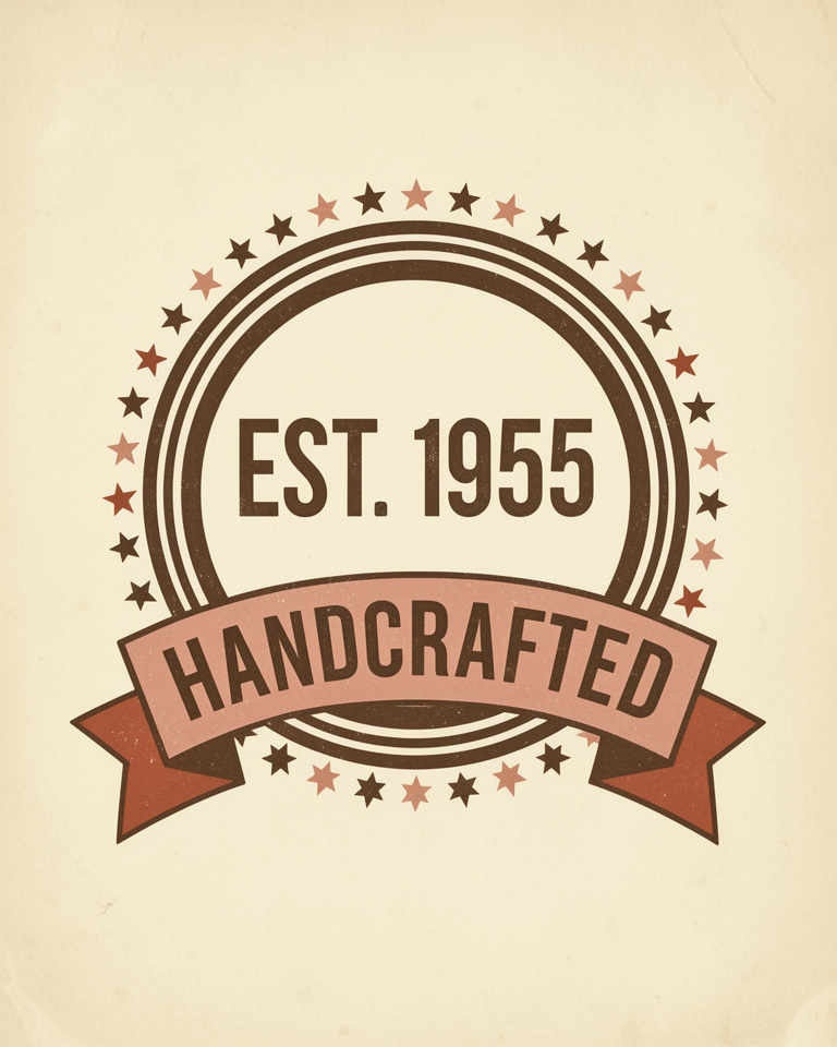
Circular or shield-shaped lockups, star bursts, and award ribbons drawn from mid-century packaging give the design a sense of heritage, authority, and pride.
Halftone & Grain
Dot screens, paper texture, and ink roughness suggest printed or screen-printed origins. These imperfections signal handcraft and pre-digital production methods.
Heritage as a brand asset
Retro design is most powerful when the product it represents has genuine craft, tradition, or regional character behind it. It is a visual promise of quality and history; audiences are sophisticated enough to feel when that promise is hollow.
- 01Craft Food & BeverageCraft beer, artisan spirits, small-batch coffee, and specialty food brands
- 02Clothing & Lifestyle BrandsWorkwear, denim, outdoor gear, and vintage-inspired apparel
- 03Vinyl & MusicRecord stores, music labels, concert venues, and audio equipment
- 04Hospitality & RestaurantsDiners, barbecue joints, roadside hotels, and neighbourhood bars
Craft that earns its heritage
The best retro sites earn their nostalgic register through genuine product authenticity. These examples demonstrate how the aesthetic serves brand story rather than merely decorating it.
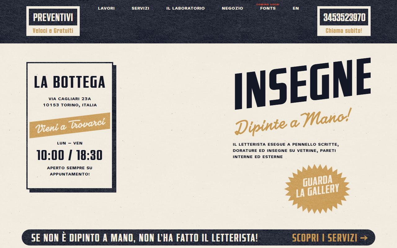
A Turin hand-painted signs studio whose site IS the product: cream paper texture, gold and navy palette, starburst badges, and script-meets-slab-serif typography straight from 1950s advertising.
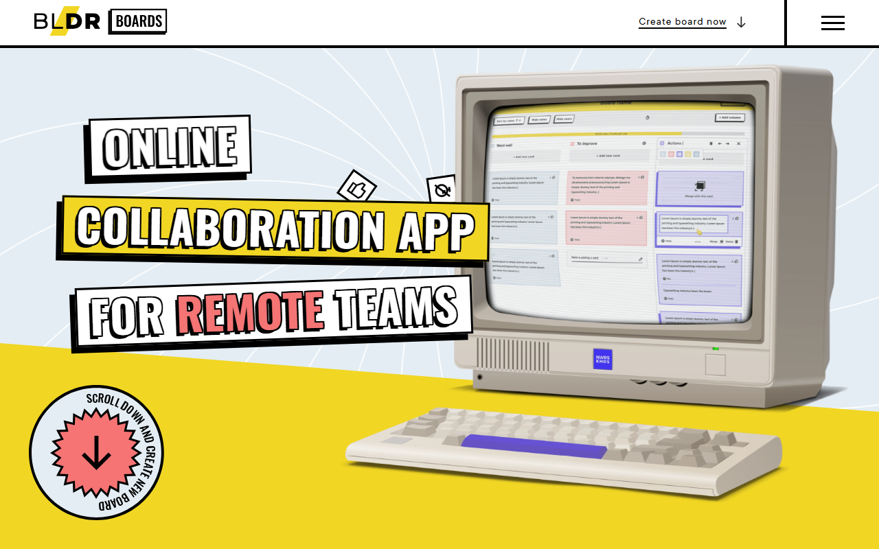
A product strategy tool that uses a warm retro illustration style — hand-drawn characters, muted tones, and badge typography — to make collaborative planning feel human and playful.
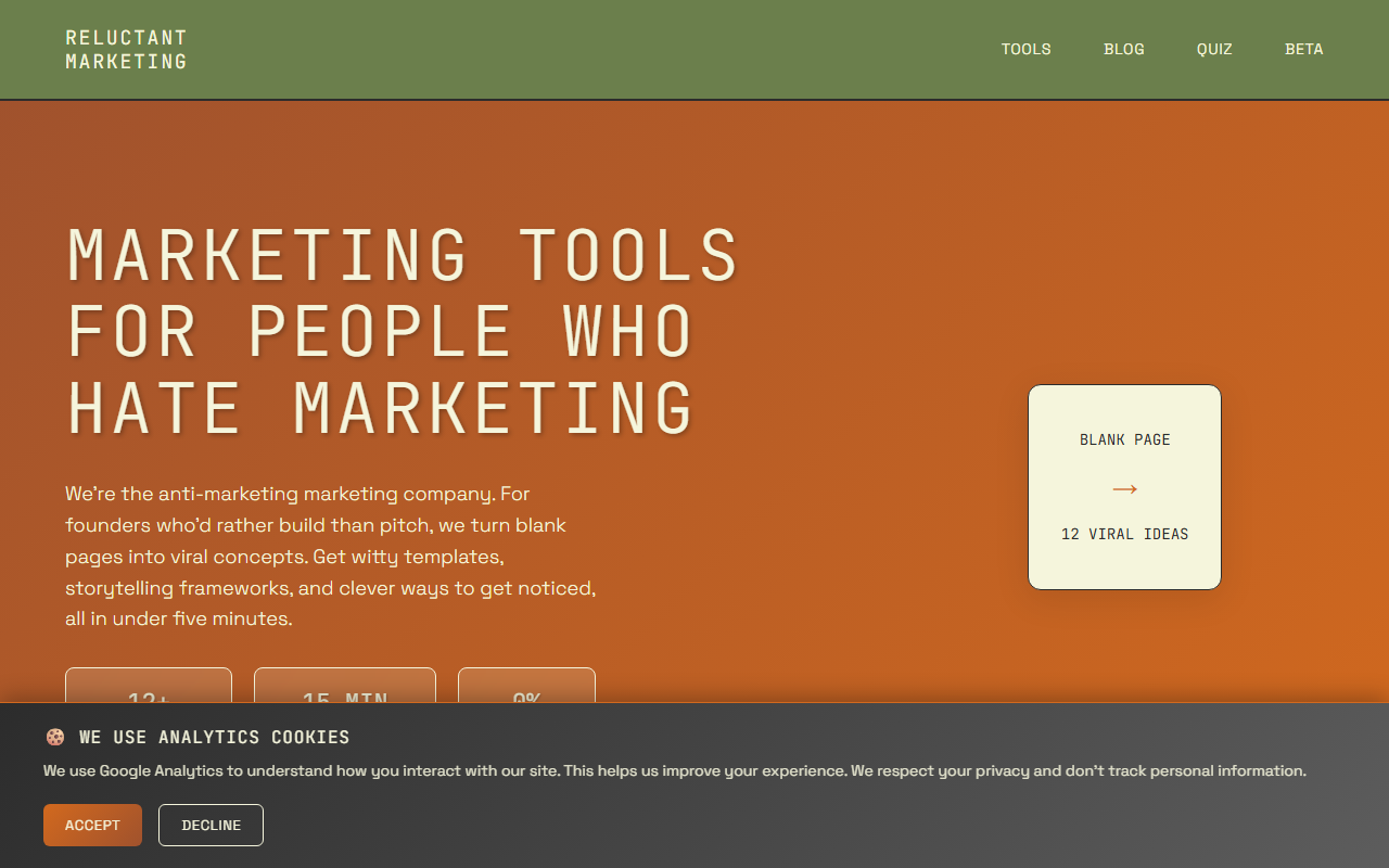
An anti-marketing tool for founders that commits to a 1970s earth-tone palette — terracotta, olive, and warm cream — applied to a modern SaaS layout with knowing retro typography.
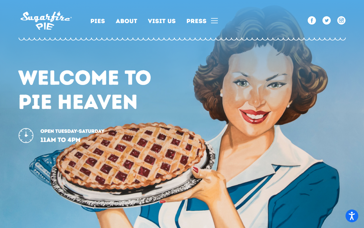
A pie shop site that earns its retro register entirely through the product: hand-lettered type, warm photography, and a layout that feels like a diner menu from another decade.
The trade-offs
+ Strengths
- Immediately warm and trustworthy: evokes craftsmanship and earned reputation
- Differentiates strongly from tech and startup aesthetics dominated by clean sans-serifs
- Richly cultural: connects to genuine craft traditions and regional identity
- Ages gracefully; a good retro site looks intentional rather than dated over time
− Watch-outs
- Easy to produce generic "vintage" work that feels costume rather than heritage
- Requires real typographic skill and type library investment to execute well
- Can feel exclusionary or appropriative if cultural references are shallow or misapplied
- Muted palettes and grain overlays can reduce legibility on low-quality displays
Builds coming soon
This style hasn't been built yet. Check back later.