Bauhaus
Form Follows Function
The most influential design school ever built, fusing art with industry. Clean geometry, primary colors, and the radical conviction that good design belongs to everyone, not just the wealthy.
A School That Shaped the Century
Walter Gropius opened the Bauhaus in 1919 with a manifesto: tear down the wall between fine art and craft. In just 14 years before the Nazis forced it to close, the school reinvented typography, architecture, furniture, and graphic design; its diaspora seeded design education worldwide.
Founded in Weimar
Walter Gropius establishes the school with the goal of unifying art, craft, and industry under a single pedagogy of making.
Move to Dessau
The iconic Dessau building, designed by Gropius himself, becomes the school's physical manifesto: grid windows, flat roof, form-follows-function in steel and glass.
Closure & Diaspora
Nazi pressure forces the school to close. Masters and students scatter to the US, UK, and Israel, spreading Bauhaus principles into every design tradition that followed.
Permanent Revival
Every design system, every grid framework, every sans-serif type stack owes a debt to Bauhaus. It is less a "trend" than the invisible grammar of modern design.
Geometry, Function, and Clarity
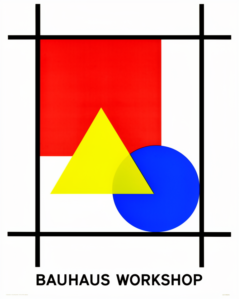
Geometric Forms
Circles, squares, and triangles are the building blocks. Decoration is rejected: every form must justify its presence through function, proportion, and structural logic.
Primary Color System
Red, yellow, and blue (assigned to triangle, square, and circle respectively by Kandinsky) form a systematic color language that is instantly legible and universally taught.
Functional Typography
Herbert Bayer's Universal typeface and the preference for sans-serif letterforms treat type as architecture: modular, grid-aligned, and stripped of historical ornament.
Unity of Art & Craft
No hierarchy between fine art and applied craft. A woven textile, a chair, and a building poster are equally rigorous design problems deserving the same intellectual care.
When Clarity Is the Statement
Bauhaus works wherever intellectual credibility and visual authority matter more than warmth or approachability. It suits institutions, cultural organisations, and premium products that want to signal rigorous thinking without resorting to trend.
- 01Cultural InstitutionsMuseums, architecture schools, and design foundations that need authority without ostentation.
- 02Architecture & InteriorsPortfolios and studio sites where the design language itself is the work on show.
- 03Premium Product BrandingBrands that want to convey craft, precision, and enduring value rather than fashion or novelty.
- 04Design EducationCourses, curricula, and editorial projects that celebrate the history and theory of design.
Bauhaus Principles in Practice
Bauhaus-influenced work worth studying shares the school's conviction: geometric clarity and functional restraint produce work that outlasts every passing trend.
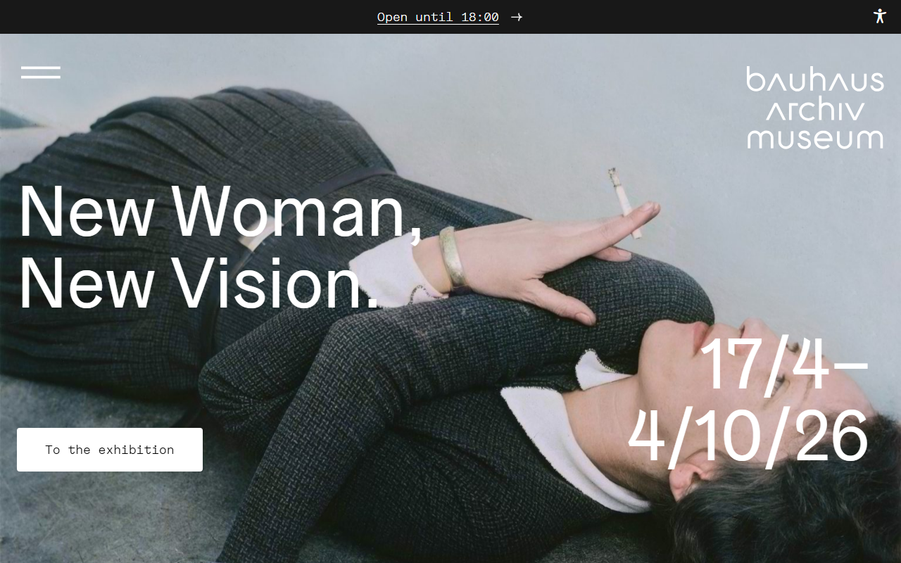
The official archive site uses strict grid layouts, primary accents, and Bauhaus's own typefaces to honour the source material with institutional precision.
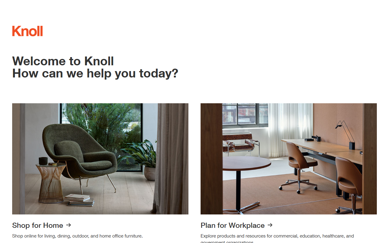
The furniture brand founded on Bauhaus principles carries the school's geometric language into e-commerce with confident whitespace and modular layout.
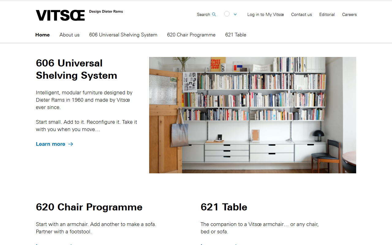
Dieter Rams's shelving manufacturer applies its designer's "less but better" philosophy to a website as rigorously functional as the products themselves.
The Museum of Modern Art's exhibition and editorial design consistently returns to Bauhaus-era grid logic and sans-serif clarity.
The trade-offs
+ Strengths
- Genuinely timeless: predates and survives every subsequent trend
- Conveys intellectual rigour and design credibility instantly
- Grid-first structure makes responsive implementation natural
- Primary color palette is accessible and universally recognisable
− Watch-outs
- Can feel cold or clinical without careful typographic warmth
- So canonical it risks looking like a design-school exercise
- Poor fit for products that need to feel playful, warm, or personal
- Requires confident restraint: the temptation to add decoration is a trap
Builds coming soon
This style hasn't been built yet. Check back later.