Flat Design
Zero Depth
Flat design stripped the web of drop shadows, gradients, and bevels and replaced them with solid color, clean type, and purpose-driven icons. Championed by Microsoft Metro and Apple iOS 7, it became the defining aesthetic of the 2010s, and the ancestor of every minimal interface since.
The Great Simplification
Flat design arrived as a direct reaction against the skeuomorphic excess of the late 2000s: leather-stitched calendars, green felt game tables, torn paper textures. Designers wanted interfaces that looked like software, not props. What followed was one of the fastest and most complete aesthetic shifts the web has ever seen.
Microsoft Metro UI
Windows Phone introduces flat tiles and bold color typography: the first major commercial platform to abandon depth effects in favor of typographic clarity.
The Web Goes Flat
Swiss-influenced flat design rapidly displaces skeuomorphism across the web; designers abandon drop shadows and gradients wholesale in search of cleaner interfaces.
iOS 7 Moment
Apple's iOS 7 goes flat; the style reaches every smartphone on the planet simultaneously, cementing flat design as the universal language of digital interfaces.
Flat 2.0
Semi-flat and "flat 2.0" with subtle shadows and micro-depth evolve the style without abandoning its core clarity; skeuomorphism has not returned, but depth has crept back in.
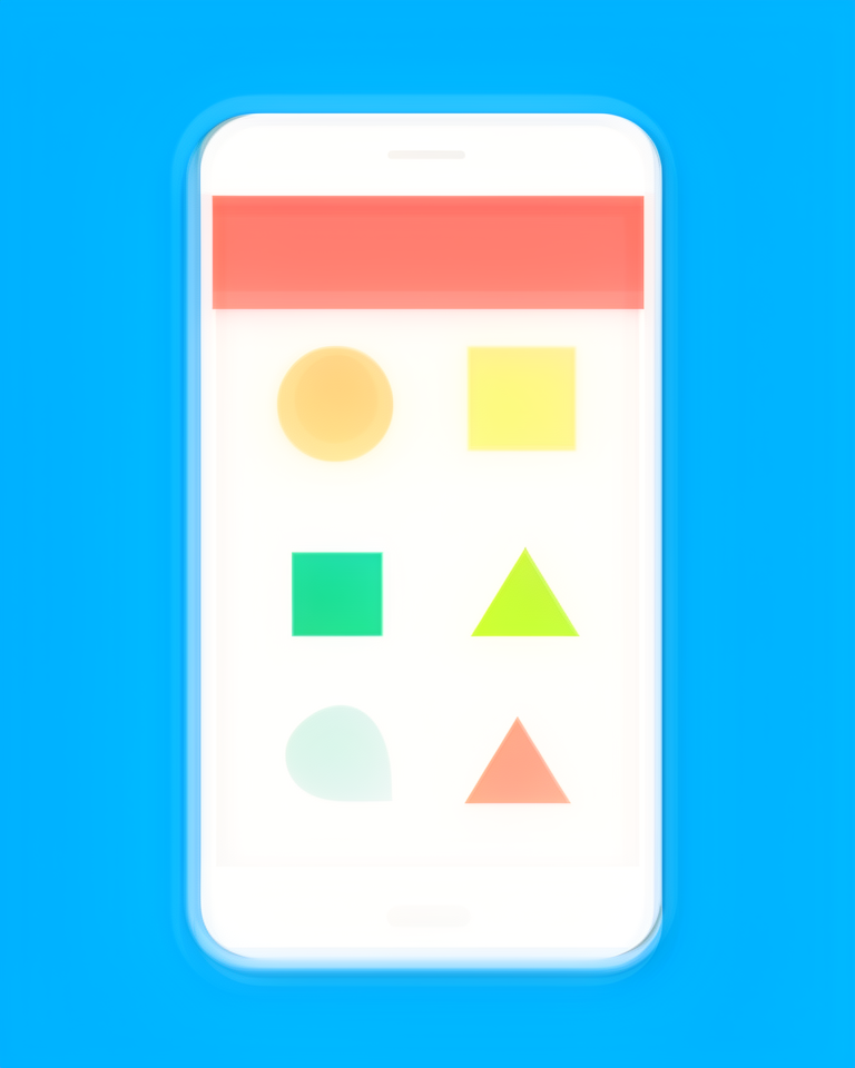
Pure Surface, Pure Function
No Depth Effects
No gradients, drop shadows, bevels, or embossing: surfaces are perfectly flat. What you see is a shape and a color, nothing more, nothing pretending to be physical.
Solid Color Blocking
Bold, saturated fills define elements without texture or shading. Color does the work of depth; distinction comes from hue and value, not three-dimensional illusion.
Geometric Icons
Simple, consistent iconography on 24px or 48px grids: no detail that breaks at small sizes, no decoration that adds meaning the form already carries.
Type-Driven Hierarchy
Weight and size alone establish hierarchy across the page; color is accent, not structure. The type system does everything that depth used to do.
Clarity at Any Scale
Flat design's fundamental strength is scalability: it works at 16px on a watch or 1600px on a monitor without losing anything. It suits contexts where consistency across devices matters, where speed and legibility are non-negotiable, and where the interface should disappear in service of the content or task.
- 01Mobile AppsTouch interfaces where simplicity and scan-ability on small screens are paramount.
- 02Product SaaSDashboard-heavy tools where users spend hours; cognitive load must stay low.
- 03Government & Public ServicesAccessibility-critical sites where every audience segment must be served reliably.
- 04Health & WellnessApps and sites where calmness, clarity, and trustworthiness must come through in every interaction.
The Flat Canonical
Flat design's most influential examples aren't individual websites; they're design systems. Platforms that normalised flatness at global scale and became the reference for a generation of product designers.
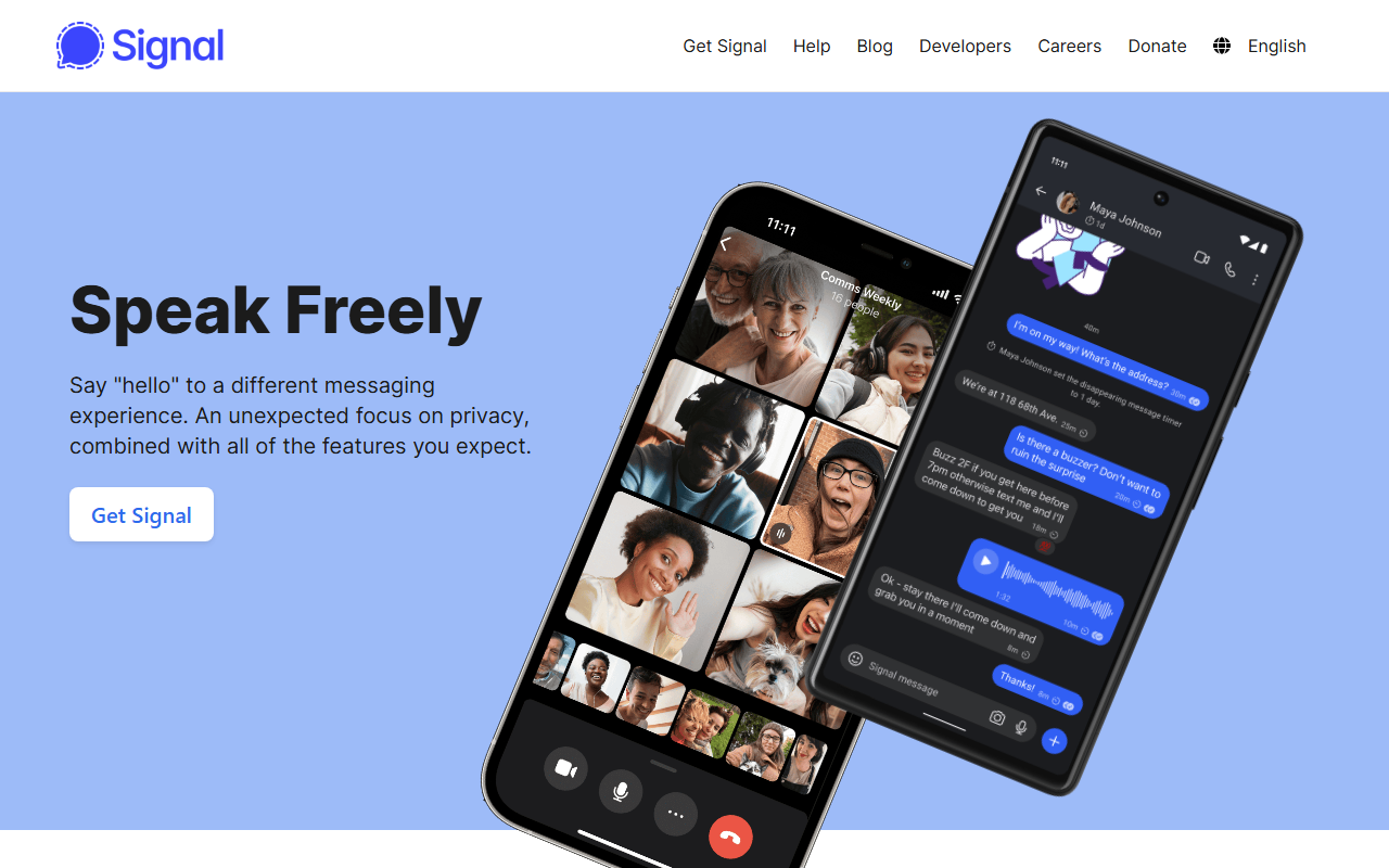
The private messaging app's site is flat design at its most principled: solid colour, no gradients, no shadows, no decoration beyond what the content demands.
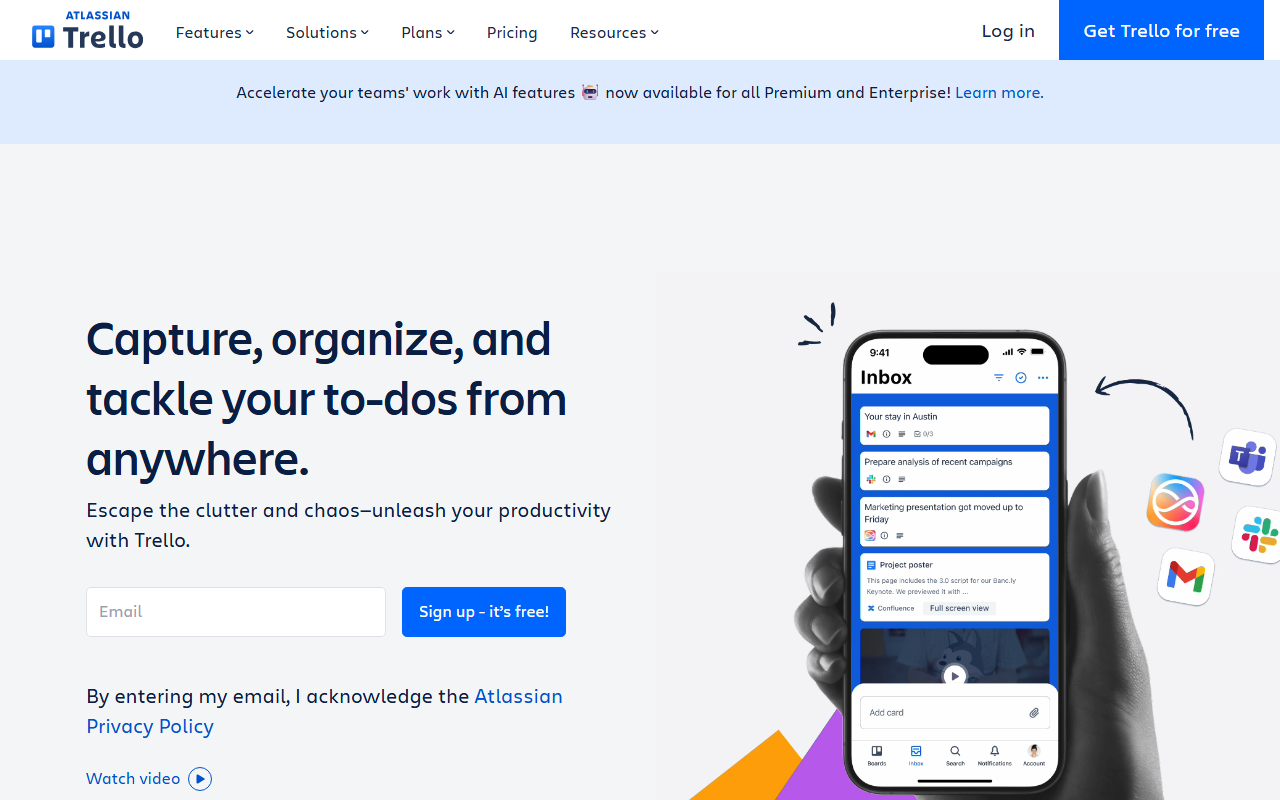
Atlassian's project board tool built its entire visual identity on flat coloured cards and bold geometry — the style's combination of clarity and colour at product scale.
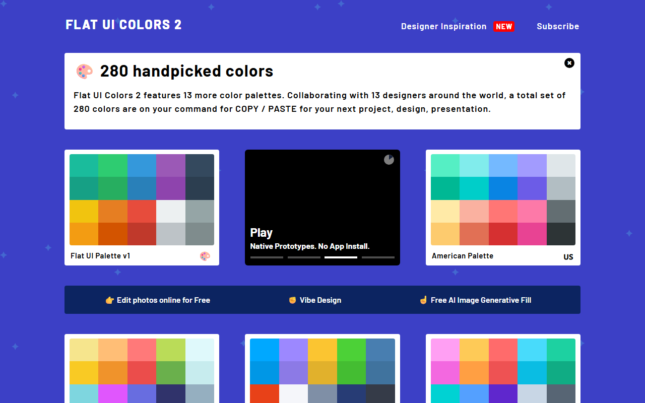
A reference palette that became a canonical resource for the style: the exact hues that defined flat design's move away from gradients and towards solid, purposeful colour.
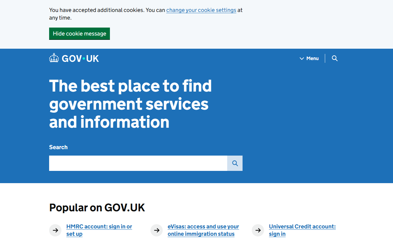
The UK Government Digital Service's design system: rigorously flat, deeply accessible, and the gold standard for public-sector digital design.
The trade-offs
+ Strengths
- Fast to load: no heavy image assets or complex visual effects
- Timeless and legible: ages more gracefully than trend-driven styles
- Scales perfectly to any screen size without losing clarity
- Easy for large teams to implement consistently through design systems
− Watch-outs
- Can feel cold or sterile: the absence of depth sometimes removes warmth too
- Limited tools for creating emotional engagement without reintroducing complexity
- Over-used to the point where distinguishing a flat design from "generic" requires real effort
- Without distinctive color or type choices, flat designs look indistinguishable from each other
Builds coming soon
This style hasn't been built yet. Check back later.