Material Design
Paper & Ink
Google's Material Design system translated the tactile properties of physical paper (elevation, shadow, and motion) into a unified, cross-platform design language. From Android to the web, it provided the first fully documented, open design system at global scale.
From a single I/O keynote to billions of screens
Material Design arrived fully formed at Google I/O 2014: complete with specification documents, component libraries, and motion guidelines that no design system had ever published so comprehensively. Three major versions later, it remains the bedrock of Android and the broader Google product ecosystem.
Material Design launches
Google introduces Material Design at I/O 2014, establishing the paper metaphor, Z-axis elevation, and a bold color system that reshapes Android overnight.
Material Design 2
Material Design 2 brings more expressive color, refined typography, and the Google Sans typeface, first visible across Google's own suite of products.
Material You & dynamic color
Material You (Material 3) adds dynamic color theming that generates a full palette from the user's wallpaper, making each device feel personally branded.
Material 3 as the Android default
Material 3 with adaptive color is now the default Android design language, fully supported in Jetpack Compose and the Flutter SDK.
The rules that make the system work
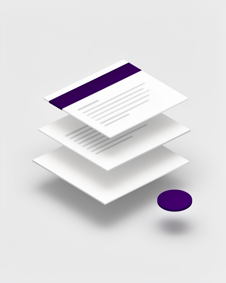
Elevation & shadow
Layers of paper-like surfaces cast realistic shadows that communicate hierarchy and state. The higher the elevation, the larger and softer the shadow: a direct metaphor for physical depth.
Motion as meaning
Shared-element transitions and physics-based animations respond to intent, not decoration. Motion shows relationships between screens rather than simply animating for visual flair.
Bold color system
Primary, secondary, and surface color roles are formally defined. Material You generates an entire harmonious palette automatically from the user's wallpaper image.
Type scale
A documented type scale from Display to Label ensures consistency across every surface. Each step carries a defined size, weight, and line-height leaving nothing to individual interpretation.
Built for scale and cross-platform consistency
Material Design is at its best when you need a reliable, well-documented foundation that multiple teams can implement consistently across Android, web, and desktop. Its component libraries save enormous time but carry a recognisable Google signature that may not suit every brand context.
- 01Android appsThe native design language: users already know every pattern and interaction
- 02Cross-platform product suitesShared tokens and components keep Android, iOS, and web feeling cohesive
- 03Enterprise web appsBattle-tested accessibility and density patterns handle complex data interfaces well
- 04Google ecosystem productsDeep integration with Workspace, Maps, and Firebase tooling makes adoption frictionless
Material in production, at scale
From the world's most used productivity suite to open-source component libraries, Material Design spans every tier of the software industry.
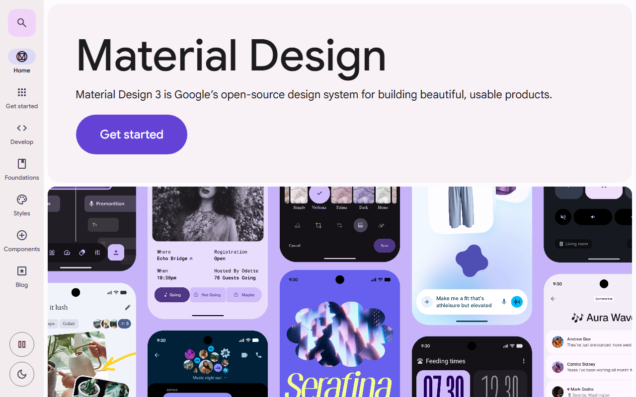
The official specification site is itself a Material Design implementation: every component, colour token, and interaction pattern documented and demonstrated in the system it describes.
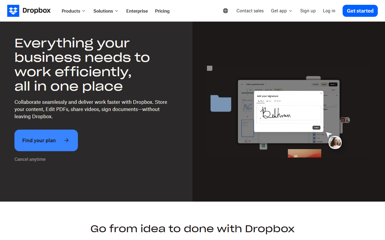
Dropbox's B2B marketing pages use Material-influenced design: clear elevation, card-based content blocks, and a colour system that signals trust and productivity.
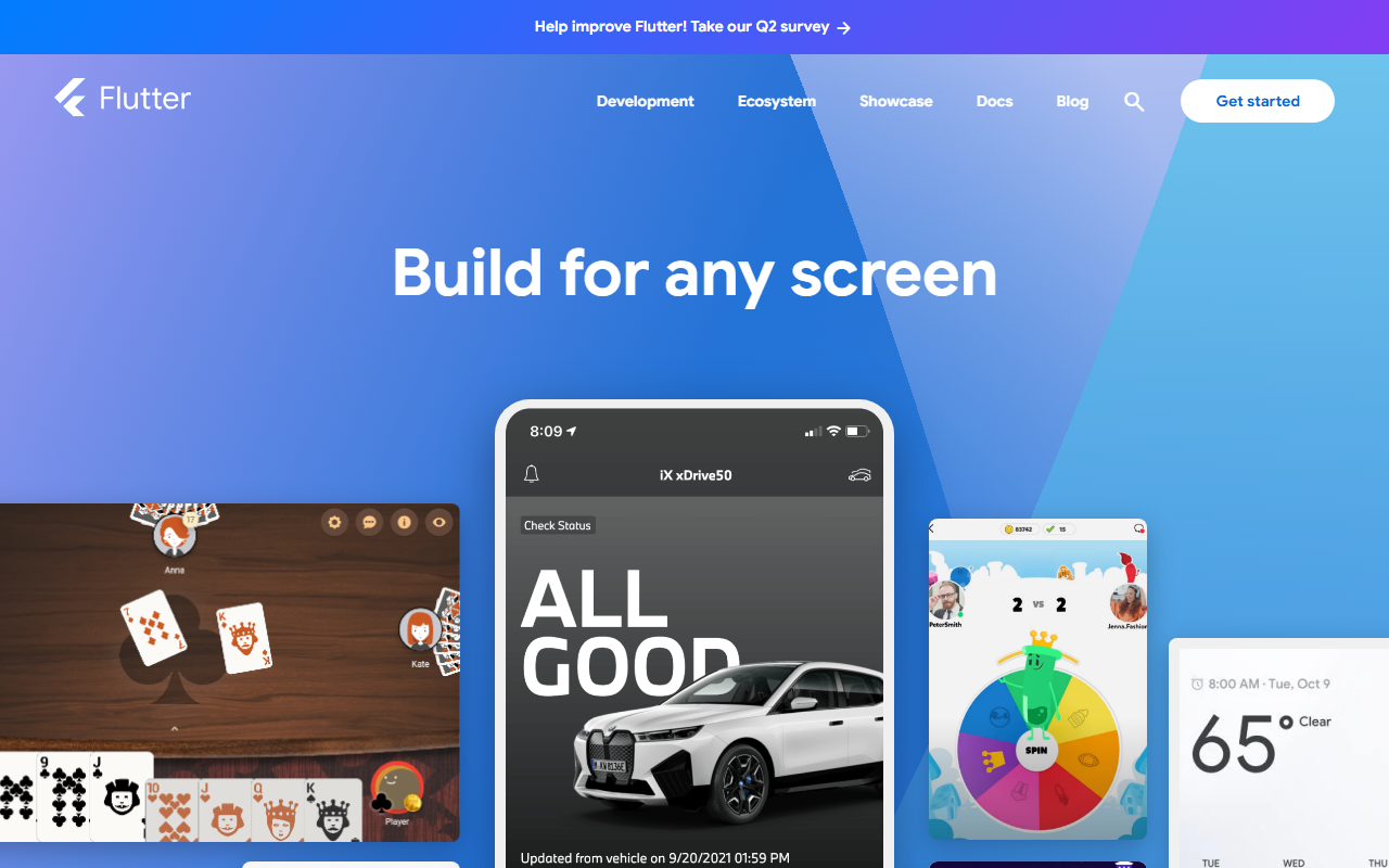
Flutter ships Material 3 as its default widget theme, spreading the language to iOS, desktop, and web apps built with the framework.
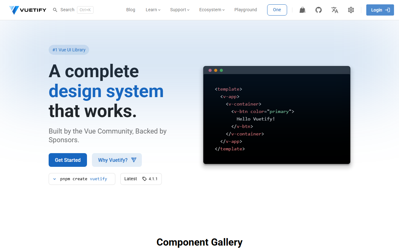
The most popular Vue.js component library implements Material Design faithfully, putting the system into thousands of web products.
The trade-offs
+ Strengths
- Exhaustive documentation covering every component, state, and interaction
- Battle-tested across billions of devices with proven usability
- Strong accessibility baseline baked into the component specifications
- Free, maintained component libraries for React, Angular, Vue, and Flutter
− Watch-outs
- Strong Google association is difficult to shed for non-Google brands
- Material 3's dynamic color system is complex to implement correctly on the web
- Default component styling risks making your product look like a Google app clone
- Elevation system can feel heavy-handed on minimal or editorial-style interfaces
Builds coming soon
This style hasn't been built yet. Check back later.