Bento UI
Grid as Canvas
Named after the Japanese lunch box: a tight, satisfying grid where every cell is a perfectly portioned content tile. Apple's product keynotes popularised it; now it's the default layout for "show, don't tell" feature showcases.
How a Keynote Became a Layout Pattern
Bento UI didn't come from graphic design theory; it came from Apple's slide decks. When the WWDC 2023 presentation used tight grids of feature cards to showcase macOS capabilities, the design community screenshotted every slide, reverse-engineered the layout, and immediately applied it to every landing page in need of a feature section. The bento box metaphor (a container with perfectly portioned, self-contained compartments) caught on instantly.
Apple's M1 Cards
Apple's M1 chip marketing uses tight, asymmetric grid cards to present specs and features: an early prototype of the aesthetic that will define the category.
WWDC Slides Go Viral
Apple's Worldwide Developers Conference presentations use bento-style grids to showcase software features; designers immediately notice and codify the pattern.
SaaS Feature Pages Everywhere
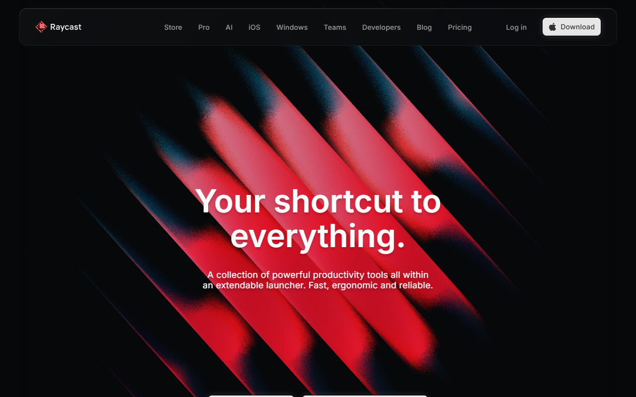
Linear, Vercel, Raycast, and dozens of other tech products adopt bento grids for their marketing feature sections; the pattern becomes the default for "show your product" pages.
Maturing Pattern
Bento is transitioning from trendy novelty to standard layout convention: a sign of genuine utility rather than pure fashion.
Everything in Its Place
Tight Grid Layout
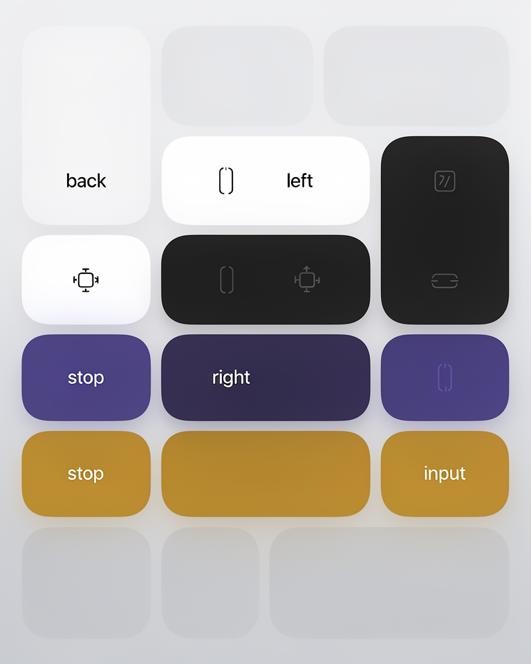
A rigid CSS grid (often with small, consistent gaps) creates the bento box framework. Cards snap into grid cells; the overall composition is deliberate and satisfying, never accidental.
Hierarchy by Size
Cells span different numbers of columns and rows, creating natural importance hierarchy without relying on typography alone. The biggest cell holds the most important feature.
Feature Cards
Each card is self-contained: title, short description, and a visual (screenshot, illustration, or animation) that demonstrates the feature rather than describing it.
Asymmetric Balance
The grid is balanced overall but asymmetric in detail (wide cards next to tall ones, large visuals beside text-heavy tiles), creating visual interest within a structured system.
When Features Need to Speak for Themselves
Bento UI is purpose-built for product marketing. It solves the "feature showcase" problem: how to present multiple features simultaneously without overwhelming the viewer. The format works because it respects the reader's visual scanning behaviour; the eye can enter anywhere and leave having absorbed something.
- 01SaaS Feature SectionsLanding page sections that need to showcase 4-8 distinct product capabilities without resorting to a bullet list.
- 02Product Launch PagesNew product or feature announcements where the visual presentation of what the product does is the core marketing message.
- 03Portfolio ShowcasesDesigner and agency portfolios where work samples need to be displayed at varying prominence without a traditional gallery grid.
- 04App Marketing PagesMobile and desktop app sites where showing screenshots in a structured, designed context demonstrates quality and capability.
Bento Done Right
The best bento layouts use the grid structure to create genuine visual rhythm, not just to follow a trend. Each cell earns its proportions through the importance of its content.

The project management tool's marketing site uses bento grids to showcase its interface; each cell demonstrates a specific workflow with the product's own UI as the visual.
The developer productivity tool's feature showcase is a masterclass in bento layout: tight grid, clear hierarchy, and product screenshots that sell the experience rather than describing it.
The originating reference: Apple's product marketing pages for software features use bento grids with consistent visual grammar, creating a template the industry still follows.
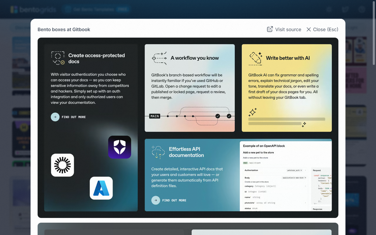
A curated gallery of bento grid implementations from across the web — the single best reference for the range and quality the pattern can achieve.
The trade-offs
+ Strengths
- Excellent for feature showcases: scannability built into the structure
- Visually satisfying: the grid creates a pleasing, complete composition
- Flexible content format: each cell can be text, image, or animation
- Grid structure is inherently systematic: easy to maintain and extend
− Watch-outs
- Overused in 2023-24: risks looking derivative rather than original
- Mobile adaptation is genuinely hard: bento grids don't stack gracefully
- Requires strong visual content in each cell; empty or weak cards collapse the composition
- Can feel formulaic if every section on the page uses the same grid pattern
Builds coming soon
This style hasn't been built yet. Check back later.