Spatial
Through the Glass
Layers you can almost touch. Depth, blur, and translucency suggest a physical world behind the screen: the visual language that Apple Vision Pro introduced and visionOS codified as the next grammar of interface design.
The Interface That Floats
Spatial design's roots reach back to the translucent dock and frosted-glass sheets of OS X Aqua in 2001, but the fully realised form arrived with Apple Vision Pro in 2023. visionOS's design language solved a genuine problem: how do you design interfaces that feel present in physical space without occluding the world? The answer (translucent panels, layered depth, and diffuse blur) became both an engineering achievement and a new visual language.
ARKit Groundwork
Apple's augmented reality toolkit establishes the technical foundations for persistent, spatially aware overlays: the engineering prerequisite for a spatial design language.
iPadOS Floating Panels
Apple introduces floating, blur-backed panels in iPadOS: a direct precursor to visionOS's window model and the first mass-market expression of spatial UI conventions on flat screens.
visionOS Debuts
Apple Vision Pro's reveal presents visionOS: a complete spatial design language with translucent window shells, layered depth, and materials that adapt to ambient lighting conditions.
Flat-screen Adoption
Designers apply visionOS conventions to conventional web and mobile design: frosted panels, layered depth, and translucency as a premium aesthetic signal even without a headset.
Depth Without Dimension
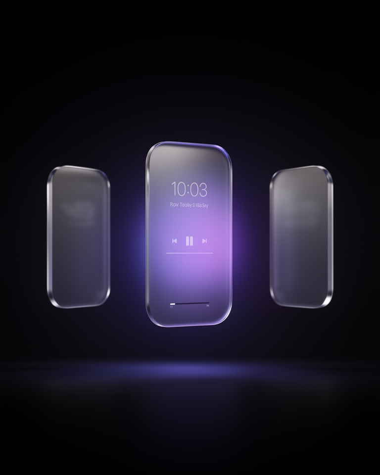
Translucent Panels
Interface elements appear as glass or frosted glass sheets floating above a background: semi-transparent, with background content blurred and tinted rather than hidden.
Layered Depth
Multiple z-levels with different blur intensities create a convincing sense of depth without perspective geometry. Foreground elements are clear; deeper layers are progressively more diffuse.
Adaptive Materials
Surfaces change their apparent opacity and tint based on the content behind them (light panels over dark backgrounds, dark panels over light), maintaining legibility across any context.
Soft Light Diffusion
Specular highlights, ambient rim lighting, and diffuse shadows suggest physical materials catching real light; the design language of spatial computing applied to flat display surfaces.
Where Premium Meets Future
Spatial design works best in contexts where the future-forward, premium quality signal is worth the implementation complexity. It is the visual language of Apple's highest-end products; the brands most likely to use it credibly are those building for that platform or adjacent to its values.
- 01VR / AR ApplicationsNative visionOS apps and web XR experiences where spatial conventions are literally correct; the UI does float in space.
- 02Premium Native AppsiOS and macOS apps that use Apple's UIKit materials (sheet presentations, navigation bars, and toolbars) that inherit the platform's spatial language.
- 03Spatial Computing ProductsHardware and software products in the XR category where design language coherence with visionOS builds credibility and ecosystem trust.
- 04Premium Web ProductsWeb applications that apply frosted panels and translucency to signal premium quality, using the spatial aesthetic as a prestige marker on conventional screens.
Spatial Design in the Real World
The most convincing spatial design implementations commit to genuine material fidelity; the blur, translucency, and layering work as a coherent system, not as individual decorative effects dropped into an otherwise flat design.
The trade-offs
+ Strengths
- Premium and futuristic: no other style signals "next-generation interface" as clearly
- Excellent depth cues: layering communicates hierarchy intuitively
- Native to the fastest-growing new platform (spatial computing)
- Works beautifully in dark environments and with rich background imagery
− Watch-outs
- Technically demanding: CSS backdrop-filter has browser inconsistencies and performance cost
- Legibility suffers if blur and opacity aren't calibrated carefully for each context
- Can conflict with flat UI conventions; mixing spatial and flat elements looks inconsistent
- Still emerging: conventions and best practices are not yet as established as flat design
Builds coming soon
This style hasn't been built yet. Check back later.