Aurora
Living Color
Colors that breathe. Soft, multi-point mesh gradients create depth and movement without a single image: the visual equivalent of the Northern Lights frozen mid-dance. Organic, luminous, and instantly contemporary.
When Gradients Grew Up
The gradient has been a tool in every designer's kit since early computing, but for most of its history it meant a simple linear wash. Mesh gradients, with their multiple color points and organic blending, offered something different: the richness and visual complexity of photography without any images. When Figma added mesh gradient tools and AI products needed a visual language that felt both futuristic and warm, Aurora was the answer the whole industry reached for simultaneously.
Design Tool Capability
Figma and other tools begin supporting multi-point gradients and mesh-like effects, making the technique accessible to designers who previously needed Illustrator or coded solutions.
Glassmorphism Convergence
The glassmorphism trend brings blurred, layered color into UI design; Aurora develops in parallel as the non-glass version of the same chromatic softness impulse.
AI Product Visual Language
The wave of AI and machine learning product launches (OpenAI, Anthropic, Midjourney) adopt mesh gradients to communicate intelligence, possibility, and organic complexity without overt tech clichés.
Ubiquitous in Tech
Aurora gradients are so prevalent in tech marketing that they have become a genre shorthand for "AI product", as recognisable (and occasionally as generic) as the flat color era before it.
Color Without Edges
Mesh Gradients
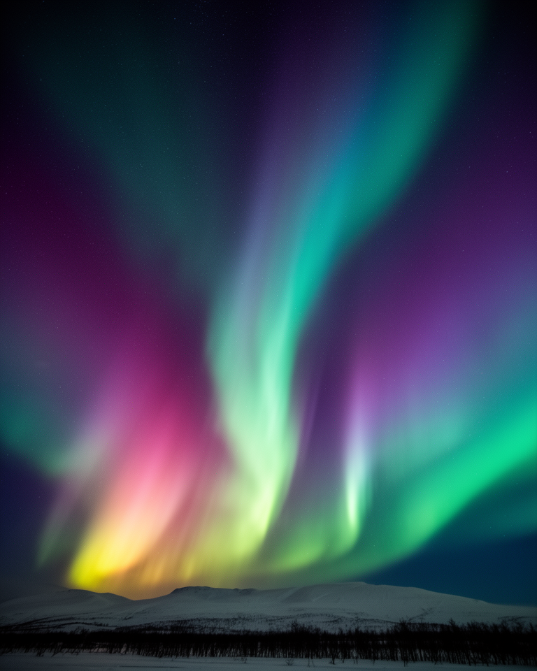
Multiple color control points blend organically: no hard edges, no linear transitions. The result is a surface that looks almost photographic in its color complexity, yet is entirely synthetic.
Organic Color Blending
Colors bleed into each other the way ink spreads in water; the exact proportions are unpredictable and unique to each gradient. This organic quality is the style's primary attraction.
Luminous Depth
Aurora gradients appear internally lit (brighter at the center, fading at the edges), suggesting depth and dimension without 3D geometry or shadows.
Animated Movement
The style's full potential is realised in motion: slow, breathing CSS or WebGL animations that shift gradient colors over time, creating a "living" background that feels ambient rather than decorative.
When the Background Is the Message
Aurora works best as a hero element: a full-page or section background that establishes emotional tone before any copy is read. It communicates intelligence, possibility, and organic warmth simultaneously, making it ideal for products that want to feel both sophisticated and approachable.
- 01AI & ML ProductsThe style's association with intelligence and possibility has made it the visual default for AI product landing pages, from chatbots to generative tools.
- 02Tech Startup HomepagesSeries A and later startups use Aurora gradients to signal that their product is premium, modern, and sophisticated without over-specifying industry.
- 03Creative Platform BrandingDesign tools, creative platforms, and media companies where expressive color signals creative capability and imagination.
- 04Premium SaaSB2B tools that want to stand out from the grey-and-white enterprise aesthetic with a more visually distinctive, premium alternative.
Aurora in Practice
The most effective Aurora implementations use gradients purposefully: as emotional scene-setting that earns its complexity by creating a genuine visual experience rather than filling space.
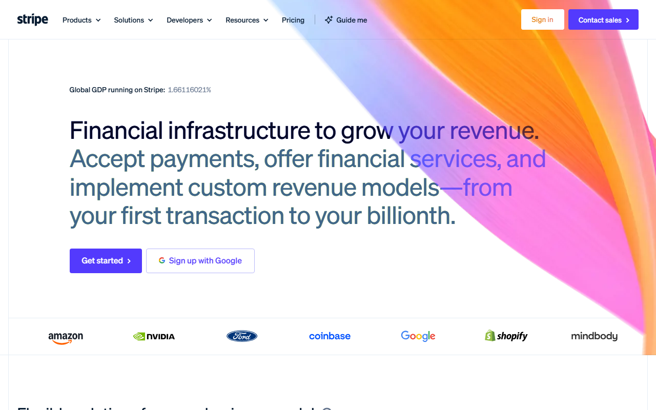
Stripe's homepage and marketing uses carefully crafted mesh gradients (purple to cyan to blue) that communicate financial sophistication and technological confidence simultaneously.
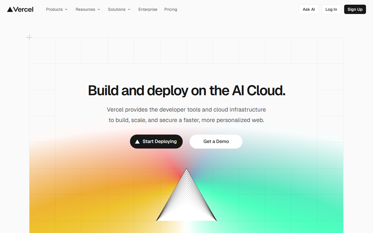
The deployment platform's marketing periodically uses flowing, dark-background gradient treatments, a stark contrast to its otherwise minimalist design system that creates memorable visual punctuation.
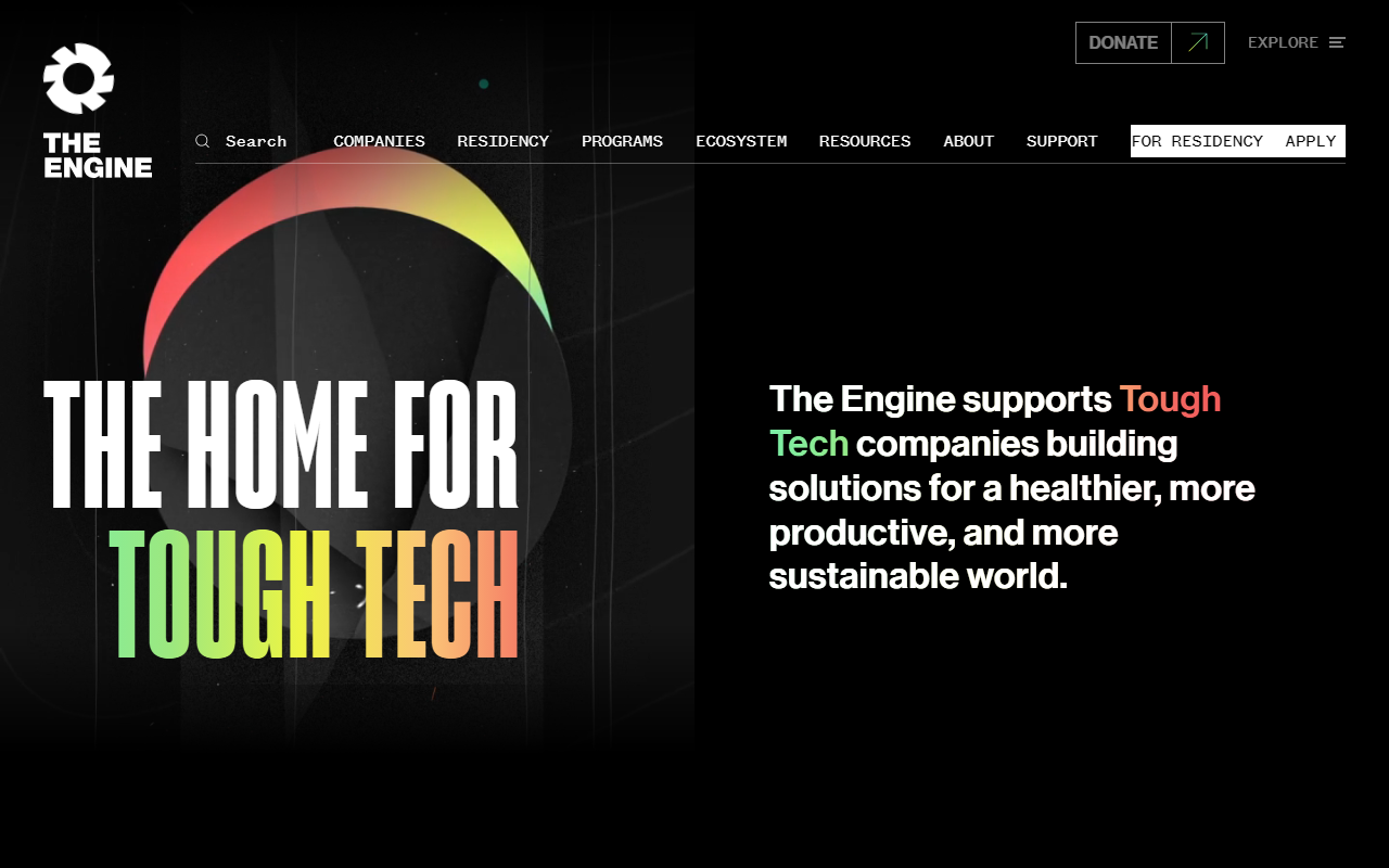
Engine's landing page uses a deep aurora gradient as its primary visual layer, letting shifting purples and blues carry the emotional weight of an ambitious infrastructure product.
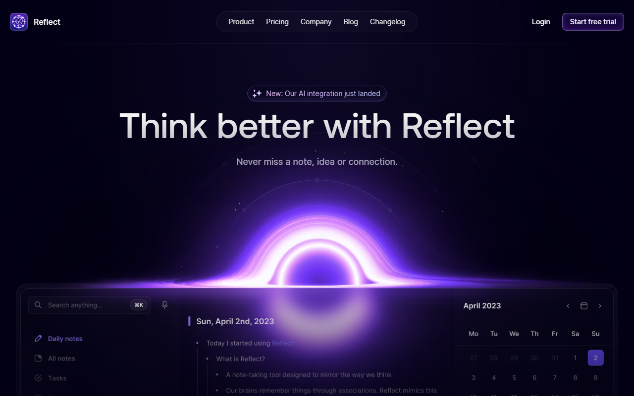
The note-taking app's marketing site centres a glowing violet orb on a dark background — a restrained aurora treatment that gives the product an air of quiet intelligence.
The trade-offs
+ Strengths
- Organic and welcoming: conveys warmth and intelligence without cold geometry
- No image assets required; pure CSS or SVG, fast and scalable
- Works in both light and dark mode with different palettes
- Animated variants create genuine "living" visual experiences
− Watch-outs
- Overused in AI/tech: risks looking generic rather than distinctive
- Low contrast: gradients can obscure body text if not carefully managed
- Animated variants carry performance cost; use cautiously on mobile
- Brand differentiation is hard when the whole industry uses the same palette
Builds coming soon
This style hasn't been built yet. Check back later.