Anti-Design
Design Against Design
Anti-Design deliberately violates design conventions (clashing typography, broken layouts, ugly colors) as a critique of commercial design culture. Born in the Italian Radical Design movement of the 1960s and revived by Tibor Kalman and the early web, it rejects "good taste" as corporate conformity.
Rebellion from Within the Discipline
Anti-Design did not emerge from outside design; it came from designers who had mastered the rules and chose to break them on purpose. From Florentine radicals to punk zines to post-internet provocateurs, it has always been a reaction against the comfortable consensus of the mainstream.
Superarchitettura
Italian Radical Design groups (Superstudio, Archizoom) reject functionalist modernism, staging provocative installations that treat design as cultural critique.
Tibor Kalman's M&Co
Kalman breaks every rulebook deliberately: ugly, confrontational, funny. He argued that "good design" had become a tool of corporate blandness.
The Digital Underground
Early web embraces broken HTML as aesthetic; zines and punk graphics go digital, and David Carson's Ray Gun influence bleeds into homepage experiments worldwide.
Post-Internet Revival
Post-internet artists and design provocateurs revive Anti-Design as a direct critique of algorithm-optimised, conversion-rate-driven commercial aesthetics.
What Makes Anti-Design Itself
Rule Violation
Every accepted guideline is broken deliberately: grids ignored, hierarchy inverted, readability sacrificed for effect. The transgression is the message, not an oversight.
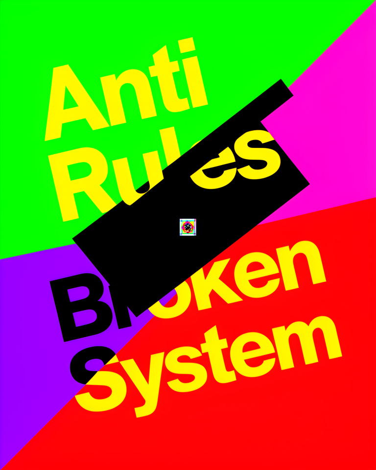
Clashing Palette
Colors are chosen precisely because they conflict and disturb: acid greens against hot pinks, dirty yellows next to eye-searing reds. Harmony is the enemy.
Broken Hierarchy
Typography is set to confuse or unsettle the reader: text overlaps, fonts compete, scale is irrational. Reading becomes an active, sometimes uncomfortable act.
Self-Referential
Anti-Design points at itself and questions its own existence: designs that expose the artifice of design, asking who these conventions serve and why we follow them.
When the Rules Are the Problem
Anti-Design earns its place when the context demands confrontation, critique, or a radical departure from predictability. It works best where the audience is already primed to engage critically, where being ignored is worse than being disliked, and where convention signals complicity.
- 01Arts & Cultural InstitutionsGalleries, experimental theaters, and arts festivals where provocation is part of the mission.
- 02Zines & Independent PublishingSelf-published works where the design is inseparable from the editorial voice and politics.
- 03Music & Festival BrandingNoise, punk, experimental, and avant-garde acts whose audiences expect to be challenged.
- 04Design Education & DiscourseAcademic contexts where dismantling assumptions is the entire pedagogical goal.
Anti-Design in the Wild
The clearest examples of Anti-Design in action are projects that generated genuine discomfort and critical debate precisely because they looked wrong, and knew it.
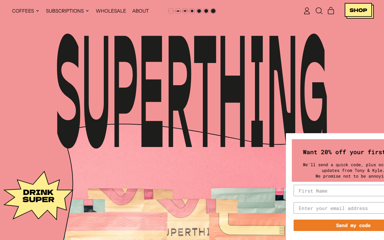
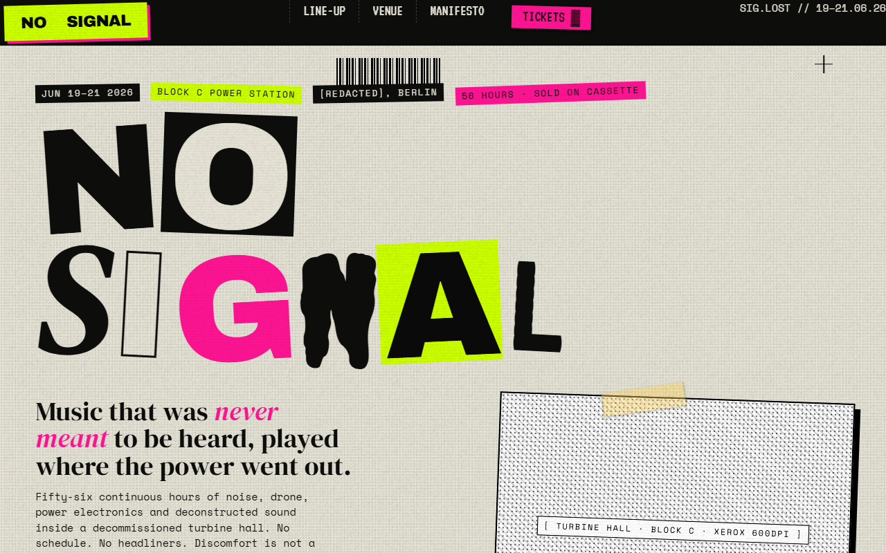
Coffee roaster whose site deliberately breaks every e-commerce convention: clashing type choices, irregular layout, and an attitude that signals authenticity over conversion rate.
Developer portfolio that rejects the animation-heavy, scroll-triggered norm: sparse, typographically blunt, and confident enough to look deliberately undesigned.
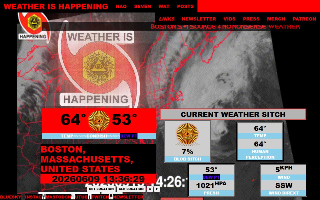
Climate data site where crude formatting, intentional misspellings, and visual chaos are the message: broken design for a breaking planet.
App site that uses deliberate visual roughness to reject the polished SaaS landing page template, making its independence from convention the entire brand statement.
The trade-offs
+ Strengths
- Produces an unforgettable identity that no template could replicate
- Challenges viewer complacency and invites genuine engagement
- Zero risk of looking like a generic or off-the-shelf design
- Demands interpretation: the audience brings something of themselves
− Watch-outs
- Alienates mainstream audiences who expect and rely on convention
- Accessibility is nearly impossible to achieve alongside deliberate chaos
- Brand recognition suffers without consistent visual repetition
- Easy to seem lazy or incompetent rather than intentional and critical
One brief, one landing page
The same prompt — "design an Anti-Design landing page" — built independently. Open any one to see the full page.