Art Deco
Gilded Geometry
Jazz Age glamour translated to the screen. Symmetrical geometry, metallic accents, and the confident belief that beauty and luxury are a civic duty, not an indulgence.
When the World Demanded Beauty
Born from the collision of modernism and luxury in interwar Paris and New York, Art Deco was a style that believed prosperity was best expressed through exuberance. Skyscrapers, ocean liners, cinema palaces, and fashion plates shared a visual vocabulary of stepped geometry, sunburst patterns, and metallic glamour that the world has never quite stopped returning to.
Pre-war Foundations
Art Nouveau's organic curves give way to a new appetite for geometric precision. The Vienna Secession and Wiener Werkstätte lay the decorative groundwork.
Exposition Internationale, Paris
The "Arts Décoratifs" exhibition names and launches the style to the world: a showcase of luxury, craft, and modernity that defines the look of the age.
Depression-era Escapism
Hollywood and the New York skyline (Chrysler Building, Radio City Music Hall) carry Art Deco into mass culture as aspirational fantasy during the Depression.
Luxury's Default Language
Wherever brands need to signal prestige, heritage, and timeless glamour, Art Deco is the go-to visual vocabulary, from hotel lobbies to watch advertisements to film title sequences.
Glamour by Geometry
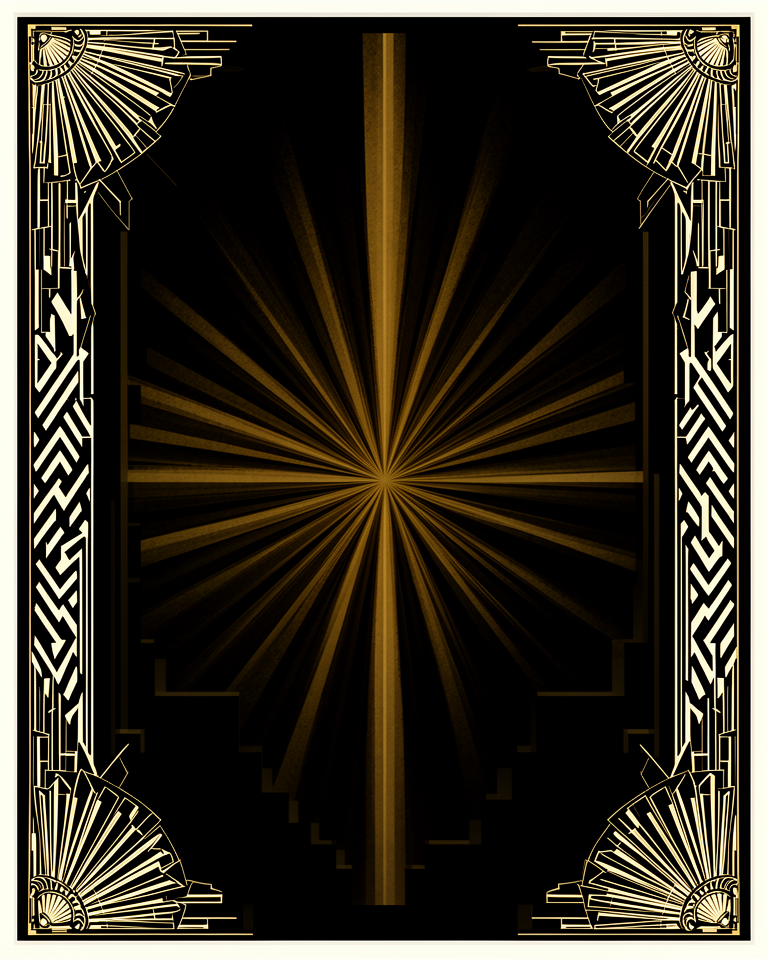
Symmetrical Geometry
Strict bilateral symmetry and stepped, radiating forms (chevrons, fan shapes, sunbursts) create a sense of formal grandeur and perfect compositional control.
Gold & Metallic Accents
Gold, brass, chrome, and black are the palette of prestige. Metallic finishes signal material value and suggest craft, even in purely digital contexts.
Streamlined Forms
The machine age expressed as beauty: tapered verticals, speed lines, and aerodynamic curves suggest modernity and forward momentum even in static designs.
Glamorous Typography
Tall, condensed letterforms with sharp geometric serifs (Broadway, Gatsby, Poiret One) carry the period's confident, vertical energy into every headline.
Where Prestige Is the Product
Art Deco works wherever luxury, heritage, and formal elegance are the primary values being communicated. It carries immediate cultural associations with wealth, taste, and timeless quality that no other style quite replicates.
- 01Luxury & Fashion BrandsJewellery, watches, haute couture, and prestige cosmetics that want to signal heritage and enduring value.
- 02Hospitality & Fine DiningHotels, restaurants, and destination brands that trade on atmosphere, glamour, and occasion.
- 03Entertainment & FilmTitle sequences, event branding, and prestige entertainment productions that need a period or classic register.
- 04Financial & Legal PrestigeEstablished institutions (private banks, law firms, historic insurance houses) where history and gravity are competitive assets.
Art Deco Built to Last
Effective Art Deco-influenced design commits to the full vocabulary (symmetry, gold, geometric precision) rather than borrowing one motif and calling it done.
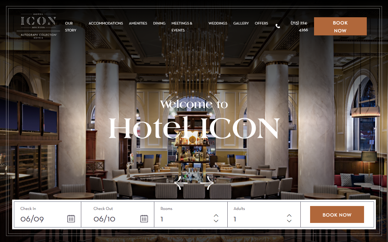
Hong Kong's Hotel ICON uses geometric precision, rich golds, and symmetrical layouts to express an Art Deco-inspired luxury hospitality identity online.
Minneapolis boutique hotel whose site deploys the full Art Deco vocabulary: chevron patterns, jewel tones, ornamental type, and a symmetry that signals considered luxury.
The hotel group uses its 1931 Deco heritage as a living design system, from building façade to website to packaging, the language consistently period-precise.
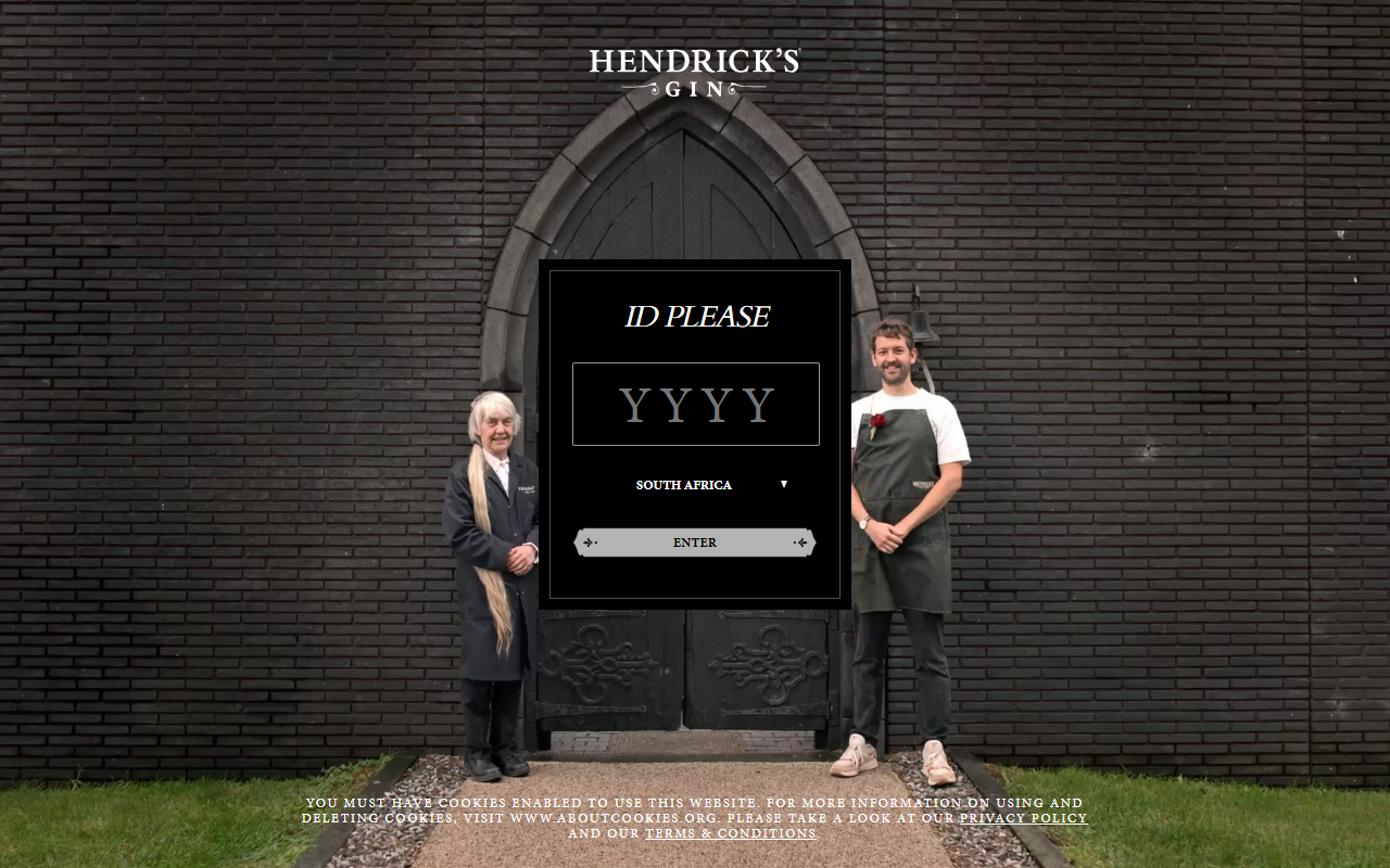
Premium spirits regularly use Art Deco geometry and typography to signal craft heritage and occasion, setting themselves apart from the minimalist mainstream.
The trade-offs
+ Strengths
- Conveys luxury and prestige with unmatched cultural weight
- Extremely distinctive: no other style looks quite like it
- Rich and developed visual vocabulary: patterns, type, ornament, palette
- Transcends trend: read as timeless and classic, not dated
− Watch-outs
- Heavy and formal: can overwhelm lightweight or conversational content
- Requires premium visual execution; poor Art Deco looks like Halloween decoration
- Cultural associations limit it to luxury and prestige: wrong register for approachable brands
- Accessibility challenges with dark, high-contrast metallic palettes
Builds coming soon
This style hasn't been built yet. Check back later.